High Fidelity – UI
User-centric designs to guide users of any experience level in the most intuitive way possible.
UI Design
Understanding users is essential to my UI work at High Fidelity. These projects ranged from formulating control overlays, to implementing elegant icon sets and building intuitive menus.

It's amazing how much thought can go into something as simple as an icon set. This task had me redesigning a set of menu icons with user understanding and visual consistency in mind. What good is a beautiful symbol if no one can figure out what it means? I'm lookin' at you, USB icon.

The split navigation menu above was a tricky challenge. At one point High Fidelity became an umbrella brand for two products: Virtual Workspace and Open Source VR. In order to separate the two I used a black and white palette, and inverted the bottom half to create contrast while keeping both brands unified under the same black and white color scheme. I preceded each sub-brand logo with the High Fidelity 'H' symbol to signify that both belonged to the same parent company.


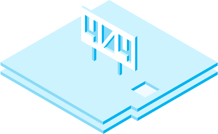


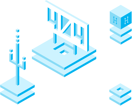
Uh oh! Looks like you're lost...
During my application process with High Fidelity I was given a homework assignment: build a 404 page. At the time, I was studying isometric design and wanted to implement it into a website somehow. I ended up using a combination of geometric graphics created in Sketch along with CSS3 animations. The result is this otherworldly realm of the lost.


