Mild Universe
San Francisco's own "disco jazz-pop" sweethearts, Mild Universe, commission a logo design
Graphic + Print Design
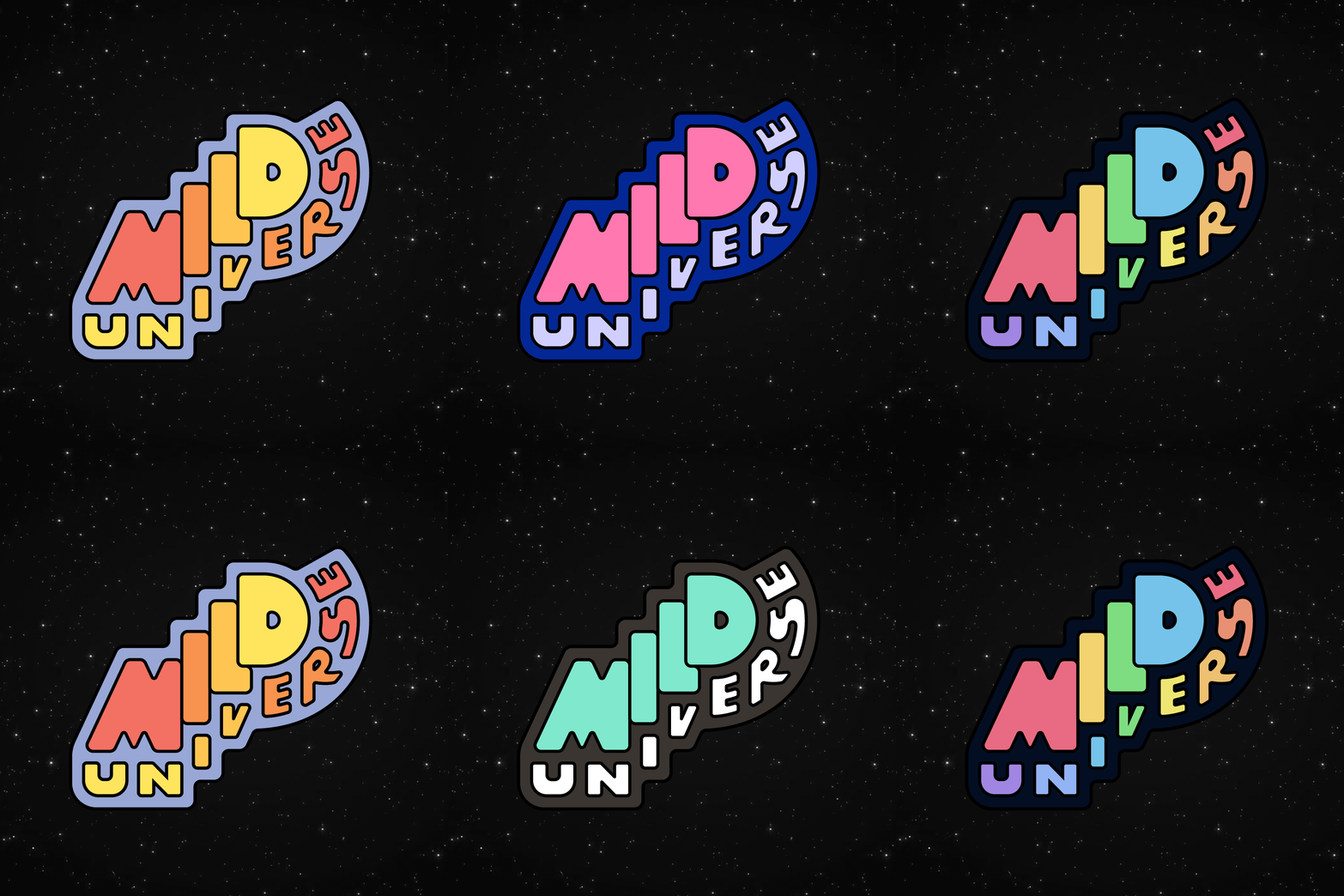
As a friend and fan of Mild Universe, I wanted to design a friendly logo that would act as a visual metaphor for their music and make people say, "Cool pin! What's Mild Universe?"
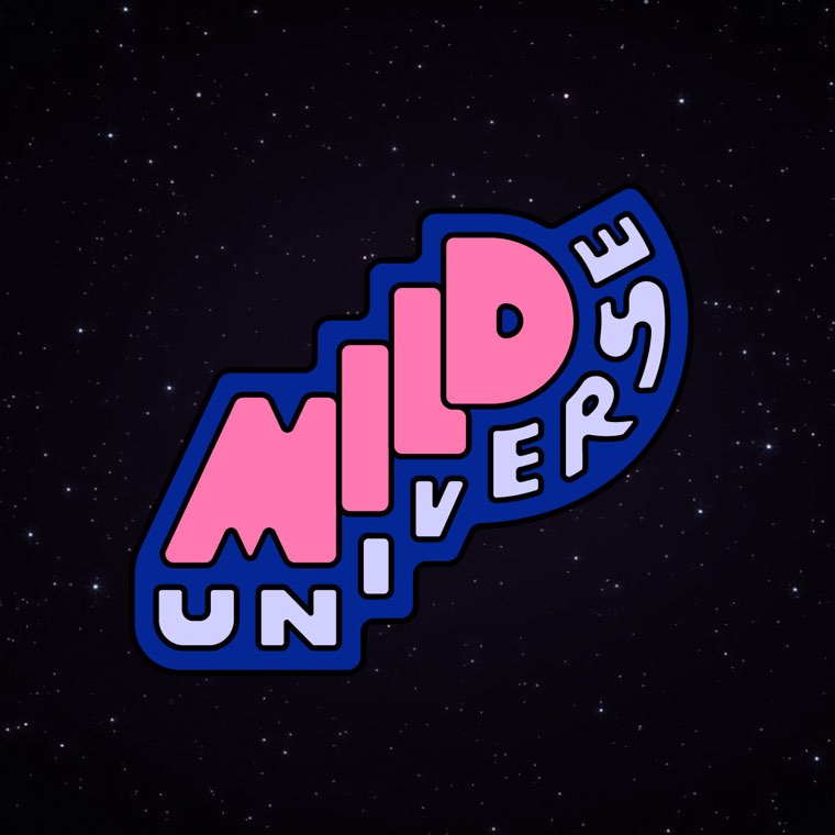
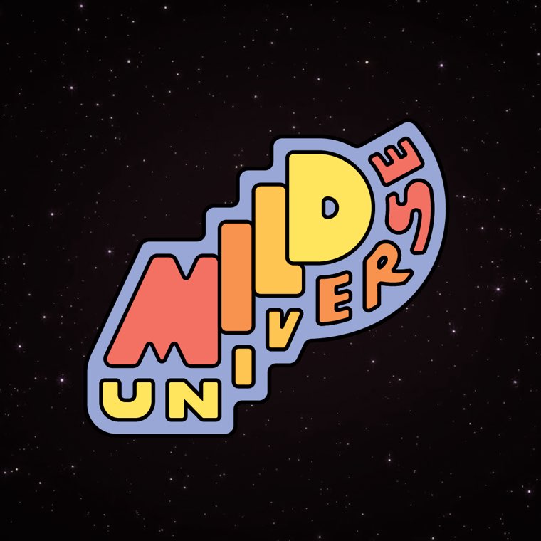
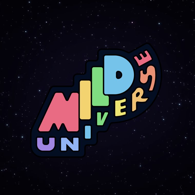
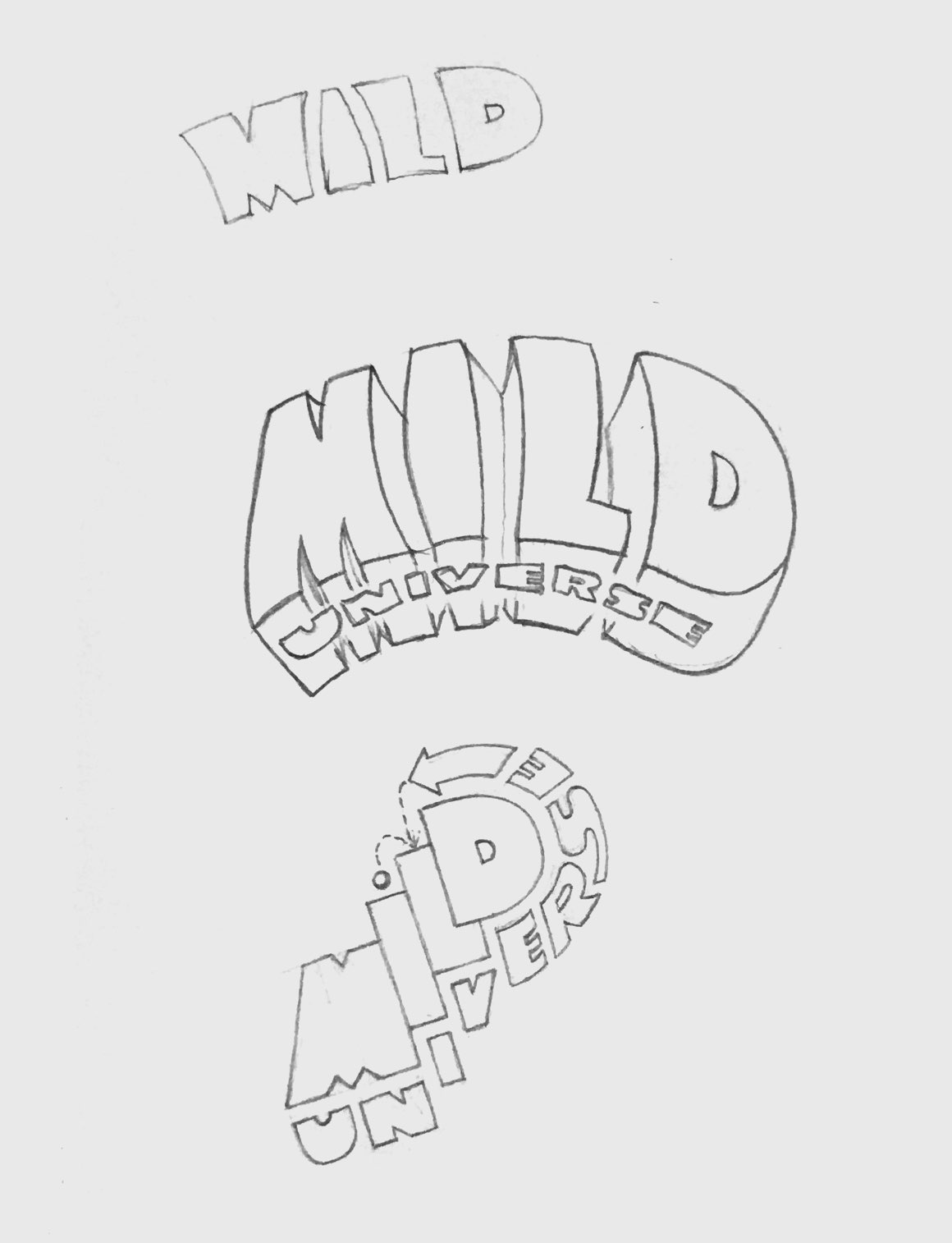
I began by collecting imagery with Mild Universe's lulling sound in mind. I arrived on a design style reminiscent of 70's comix lettering and sent some sketches over to the band for feedback. With whipped up a few more polished and colorful version before we landed on the final design.
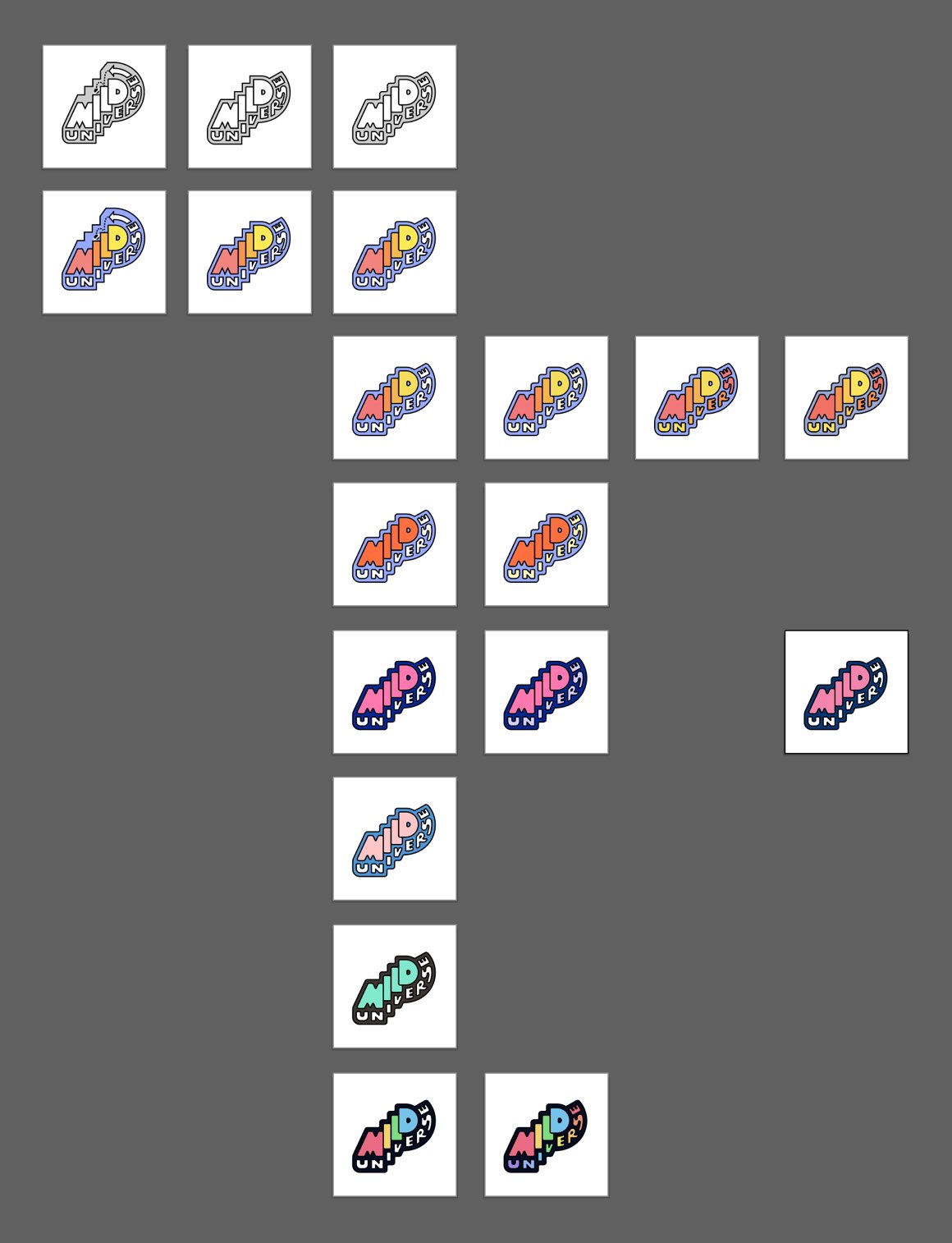
I tested out a number of bright, colorful palettes that complimented the retro 70's style lettering. Two of these colorways were chosen to be made into enamel pins.
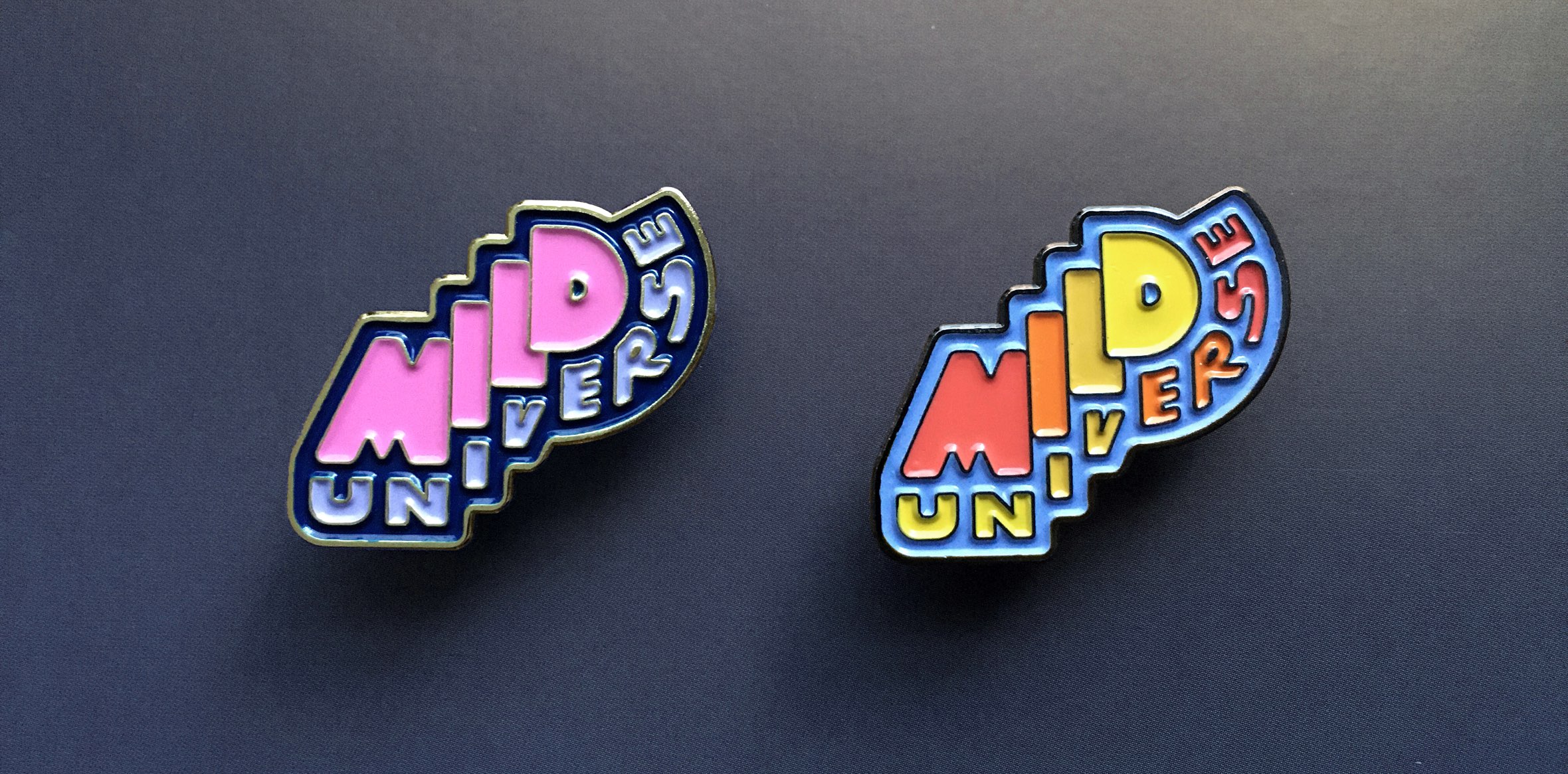
Mild Universe placed the freshly made pins up for sale at their next show, where I had a chance to see their fans interacting with the design that had only existed on a screen a few days prior. Creating artwork for enamel pins has been a goal of mine for a long while, and this project made it into a reality.
