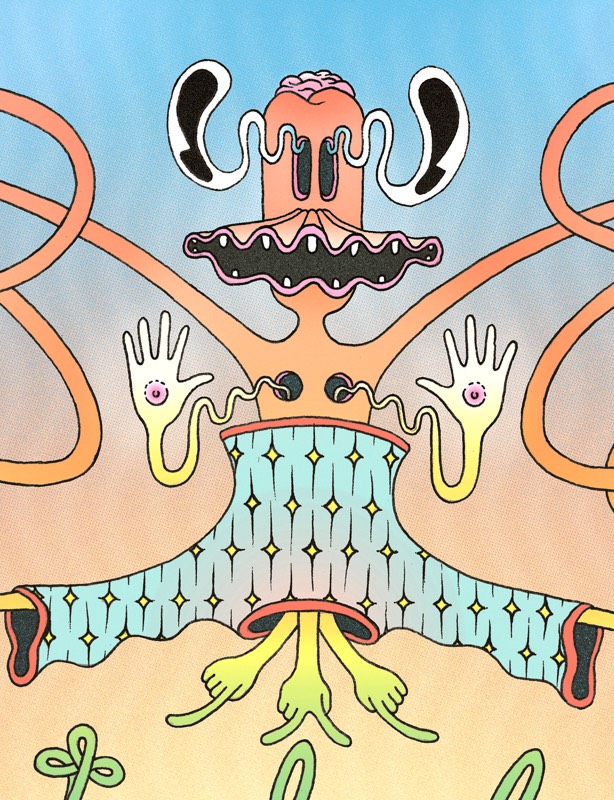
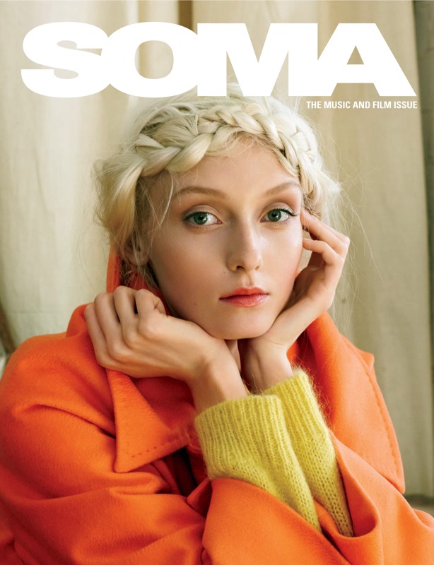
WORK Album Artwork
Oakland/London-based electropunk duo WORK sought album art to match the tech-crazed world they portray
Graphic Design
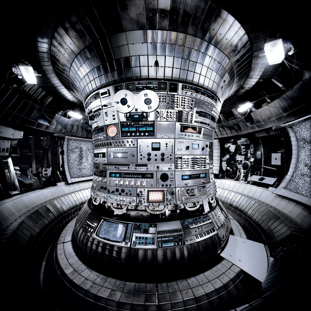
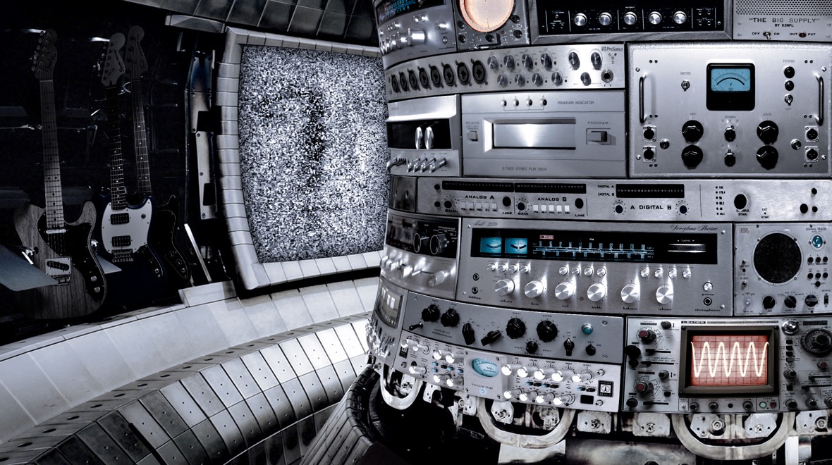
WORK approached me to create artwork for their debut release and provided the following direction: dystopian, future, clutter, chaos. The outcome is the stuff of scientist-turned-music-producer's fantasy: a nuclear fusion reactor filled with a shining array of studio equipment.
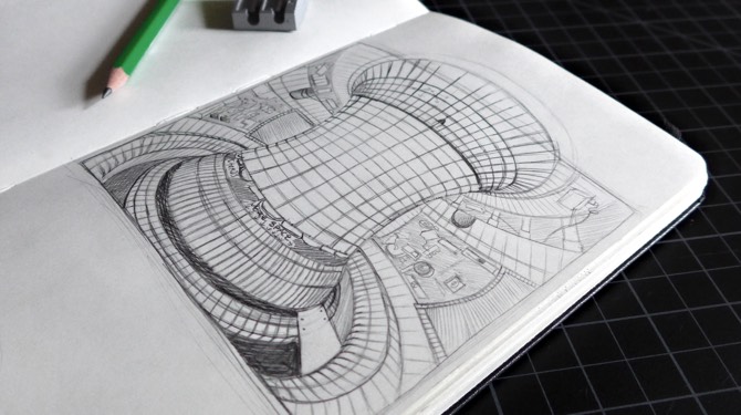
I listened to WORK's album to get into the right headspace as I started my search for a visual space to fit their playfully foreboding atmosphere. Eventually, I came across an image of a tokamak captured by photographer Thomas Struth. A tokamak is an experimental device used to produce thermonuclear fusion power. This dizzyingly high-tech apparatus seemed like it could potentially lead to the end of the world — the perfect setting to match the future-dystopian themes I was hearing. I sketched out a depiction and sent it over — they were on board.
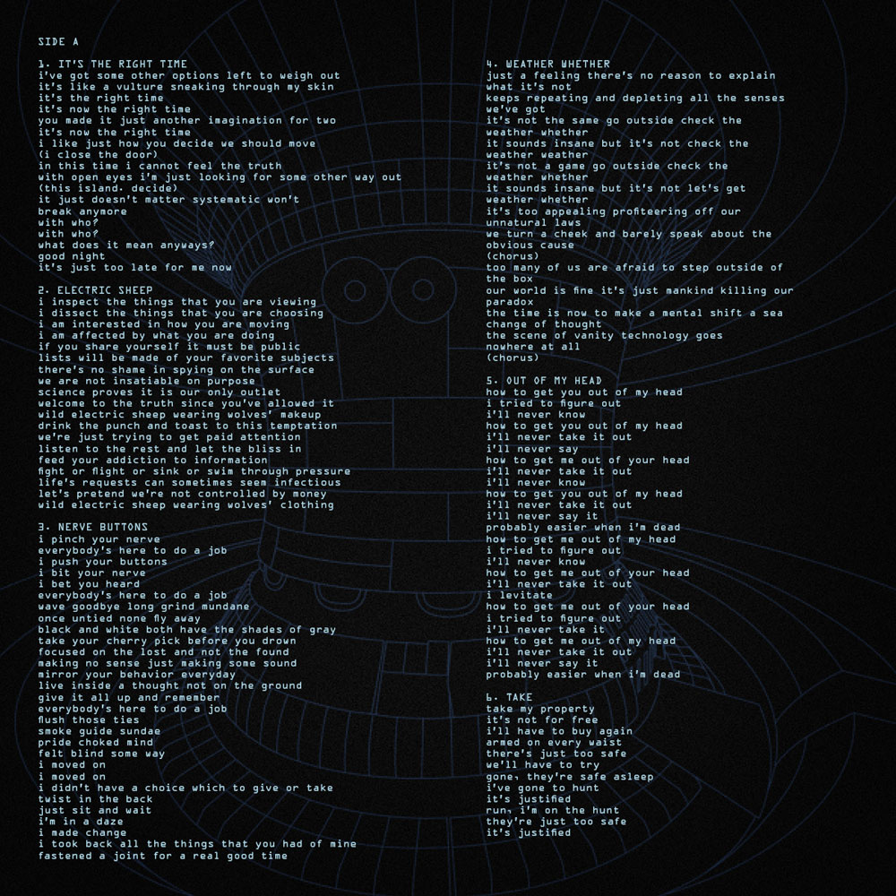
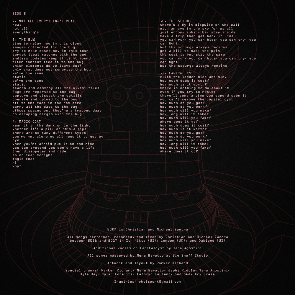
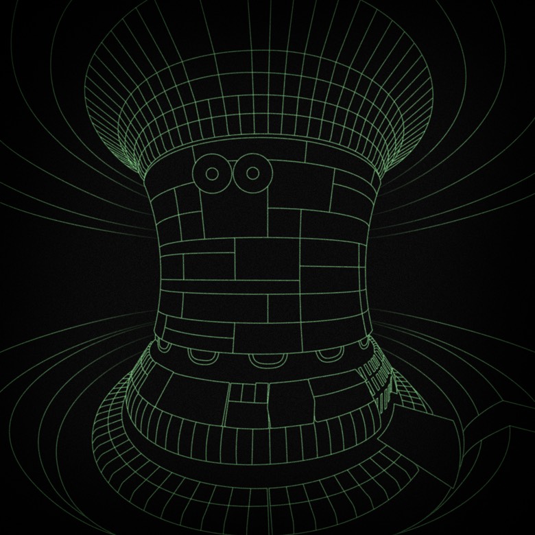
After scanning my tokamak sketch into Illustrator, I created a retro-futuristic line rendering of the apparatus. It eventually served as the background for the album insert behind an overlay of song lyrics.
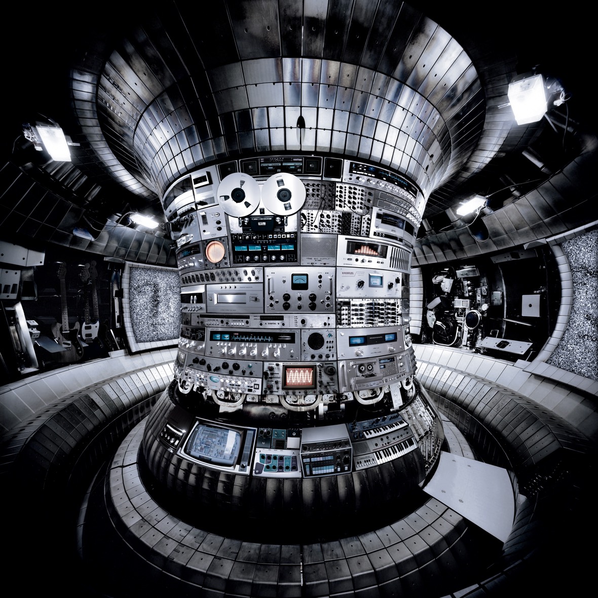
To tie the artwork into the music, I manipulated the tokamak image by filling the reactor's concave column with the same music equipment WORK used to create the melodies, rhythms and effects heard on their album. I also visited music shops around San Francisco (particularly 101 Records in North Beach) to take photos of additional vintage receivers, amplifiers, and any other gorgeous metallic equipment I get my lens on. Eventually, I had covered the entire column with shiny equipment, most of it from the 1970's and 80's.
With a grid of rectangular panels comprising the column, I already had a layout to work with. I took an image of each device from the desired angle, masked out its front panel in Photoshop, then warped its edges until it took on the right perspective and fit seamlessly into the column grid.
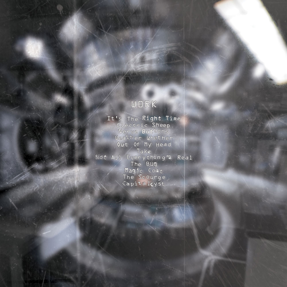
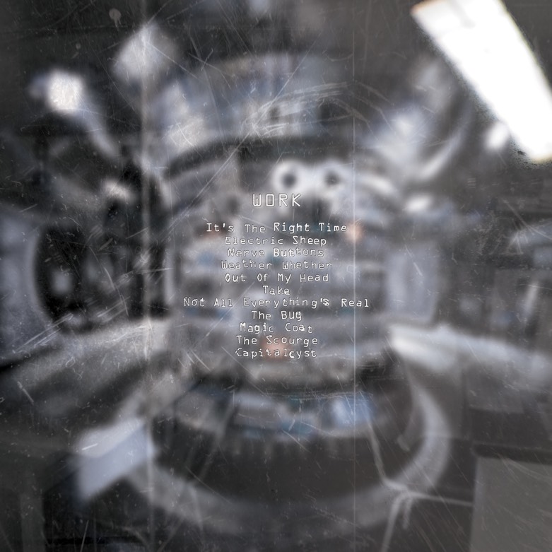
The back cover of the jacket offers a voyeuristic perspective of the tokamak blurred behind a scratched and dirty window. Track titles are overlaid in a monotype font that echoes the cold, tech-dystopian feeling heard throughout the album. I subtly chopped and distorted the text until it resembled old embossed labels one might find in a dusty laboratory. If you look carefully at the window's reflection, you can just make out some chairs and a desk in another room — perhaps a paranoid observation department where a CCTV camera watches on and on, waiting for the show to begin.
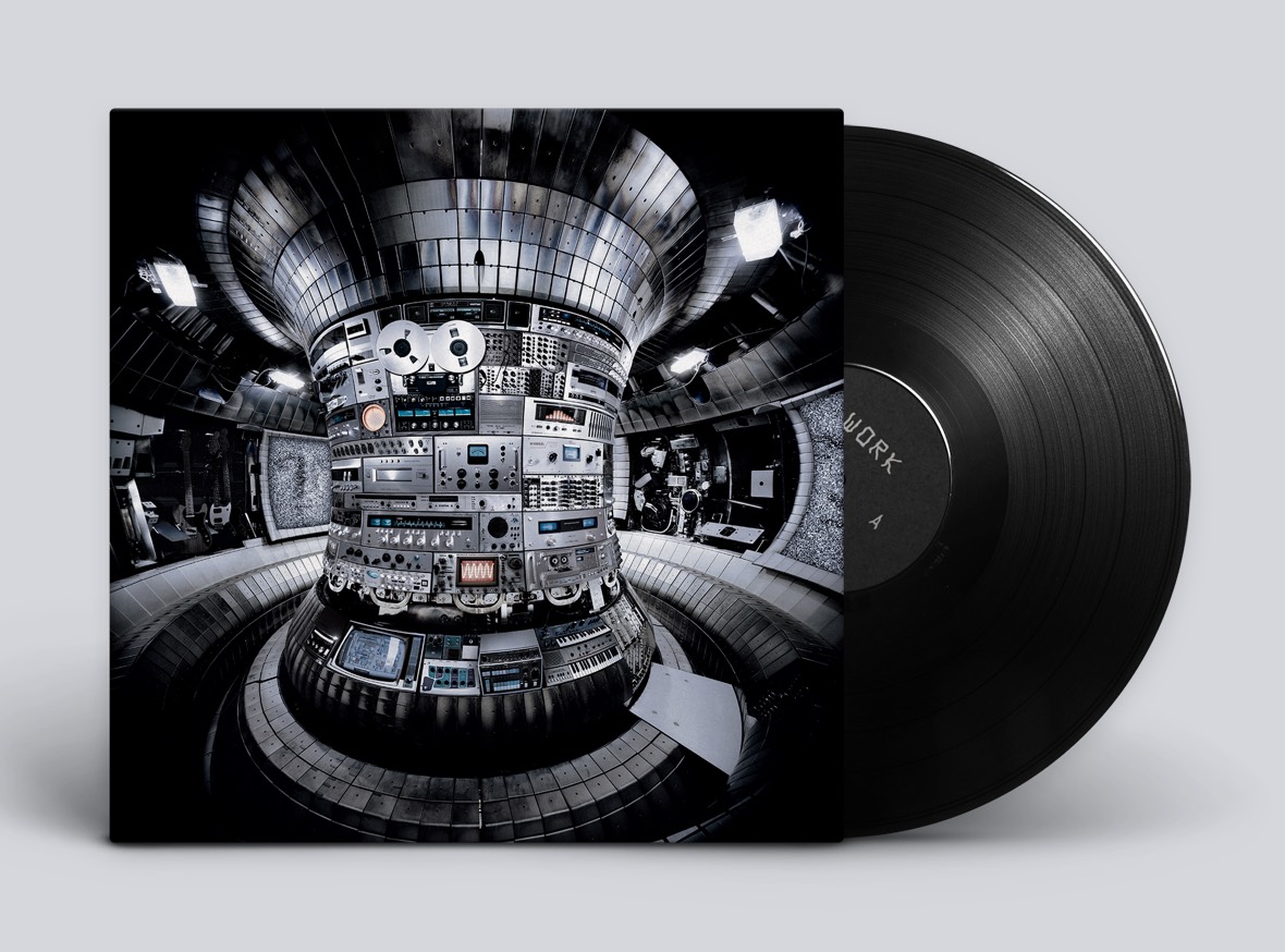
I put together this pair of animated mockups to present the jacket and insert artwork digitally. The goal here is to portray how the designs will tie together once they're printed.
