Festival de la
Cour Denis
Experimenting with new illustration techniques and redesigning the website of a lively music festival in Burgundy
Illustration and Web Design
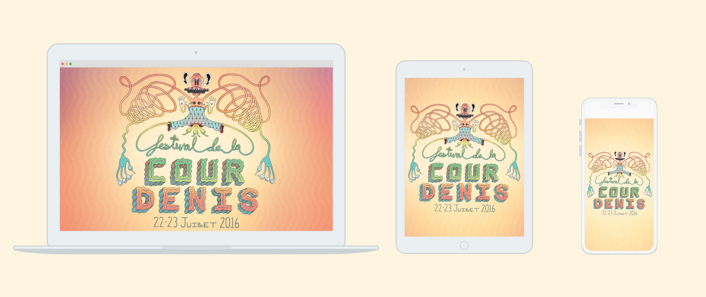
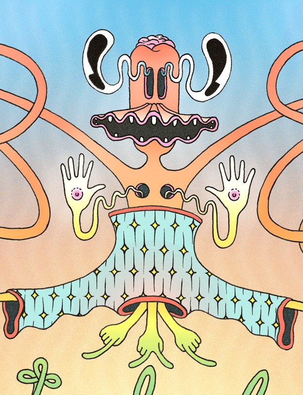
I was approached with the unique opportunity to create a poster illustration and redesign the website for Festival de la Cour Denis. After working through a few iterations, I arrived on a poster design that would be posted in towns and villages throughout Burgundy, France.
The direction I had was minimal — they more or less said "do whatever you want." While that freedom opens up an endless number of options, the lack of structure was a bit intimidating at first. It was up to me to do some research and figure out what was needed for the job. Listening to music from artists on that year's festival lineup helped me get into the mindset. I wanted to communicate the feeling of experimentation and creative freedom that seemed to surround this festival.
This being my first attempt at designing a poster, I wanted to find out not only what makes a poster stand out from the rest, but also how it can convey information in an interesting and meaningful way. Whenever I found myself strolling around San Francisco, I snapped photos and took note of posters that caught and kept my attention.
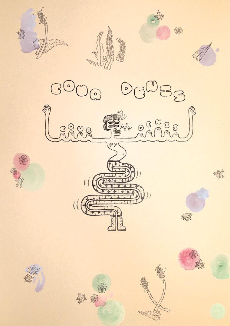
It was back to the drawing board after my first design was rejected by the festival committee. Looking at it now it's clear to me that the illustration and typography was understated, lacking attention-grabbing appeal. As frustrating as it was at the time to scrap my initial efforts, I learned from my mistakes and moved on. Not all was lost — I salvaged the successful aspects of my rejected concept and brought them into my second design process. My initial failure ultimately allowed me to reach a more cohesive and successful design in the end.
FIRST CONCEPT ▸
FIRST CONCEPT ▾
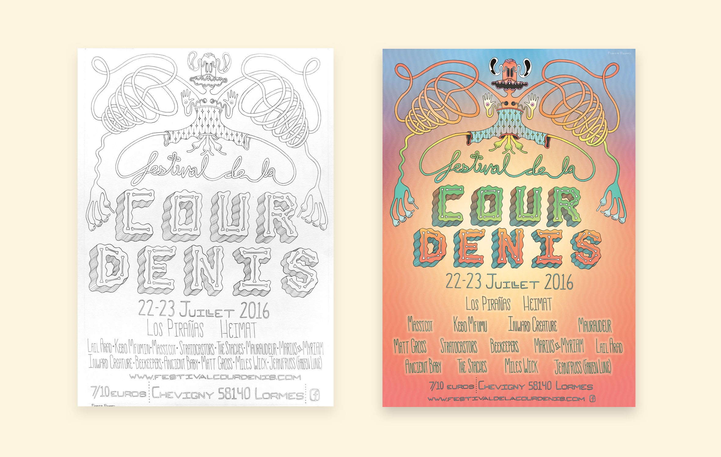
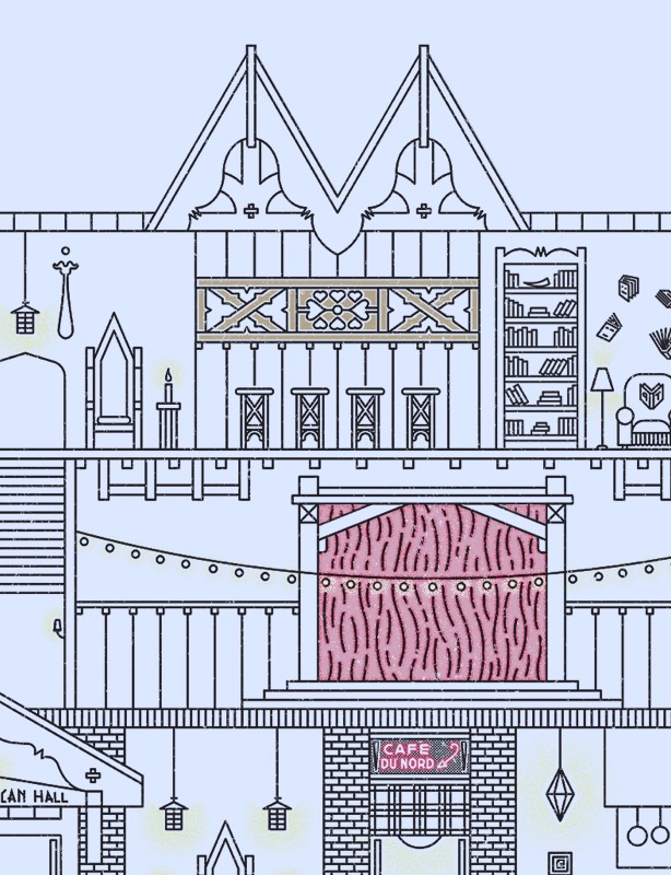
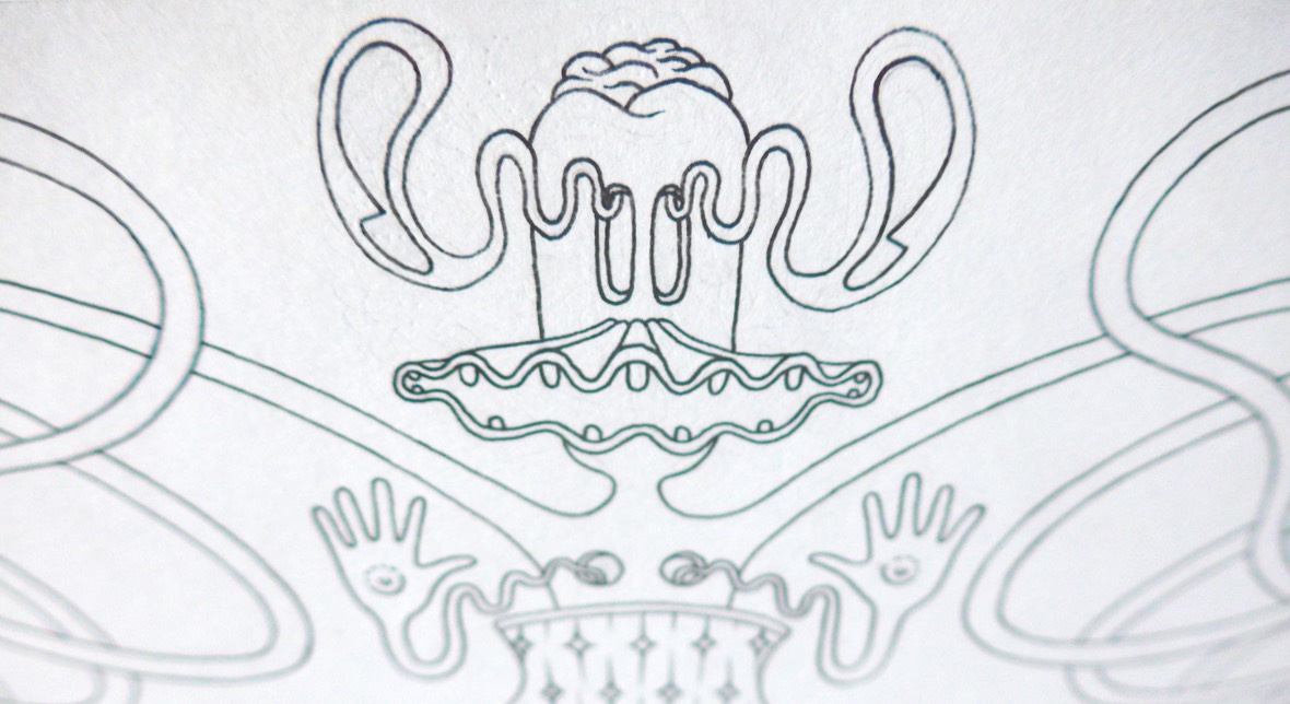
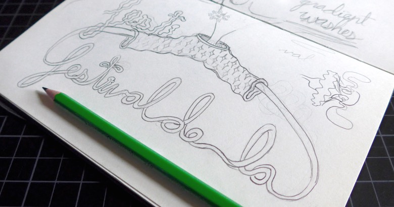
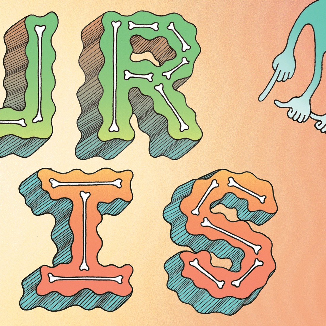
After gathering my thoughts, I began sketching out the elements that would comprise my final illustration. I took my time during the drawing and inking process, measuring everything carefully so the design would be centered and the letters evenly spaced. Even after careful planning it wasn't quite perfect — if you compare the typography in the line drawing to that of the final poster you can see that 'Cour Denis' was a bit too large with the lineup squeezed in below. I resized it in Photoshop so everything would fit with room to breathe.
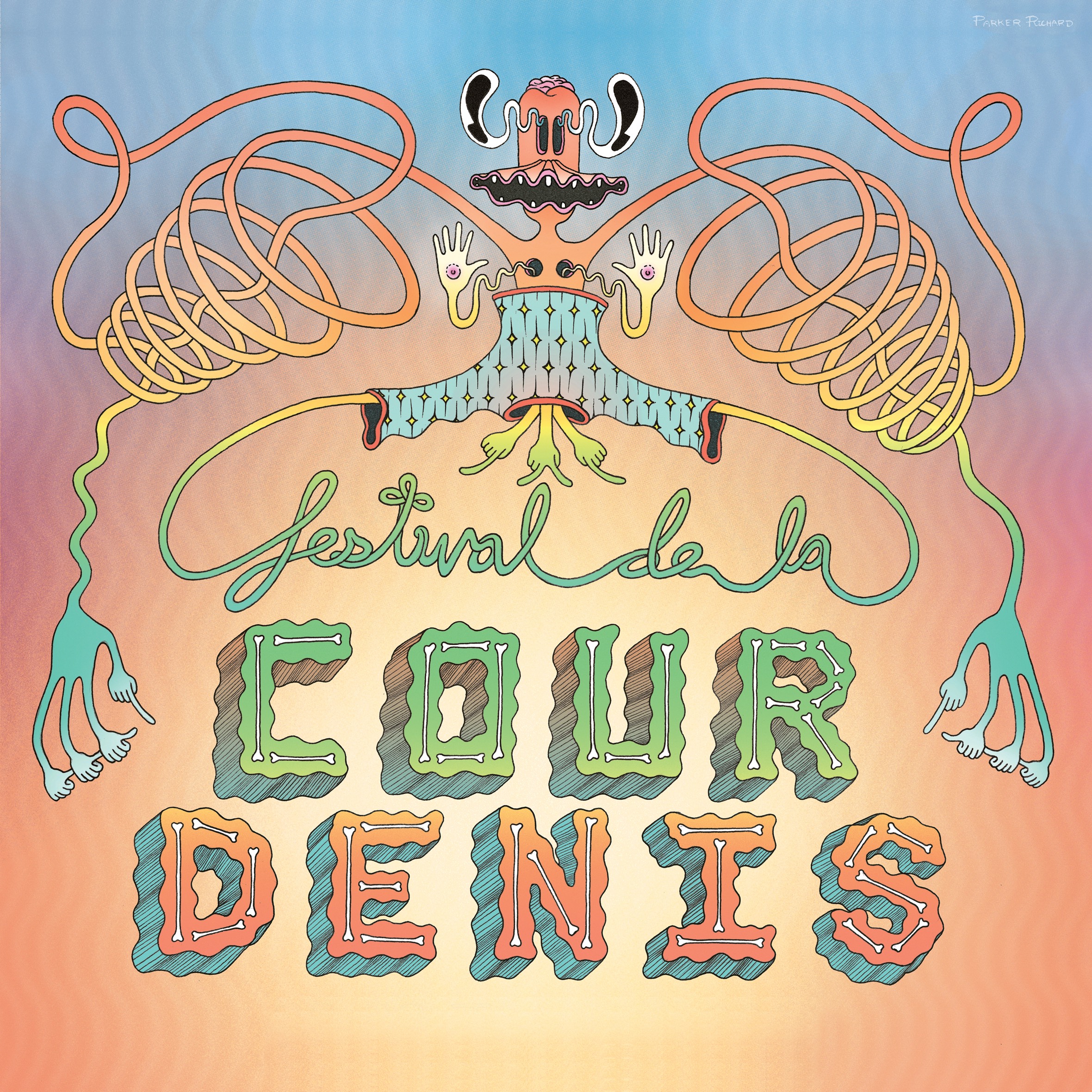
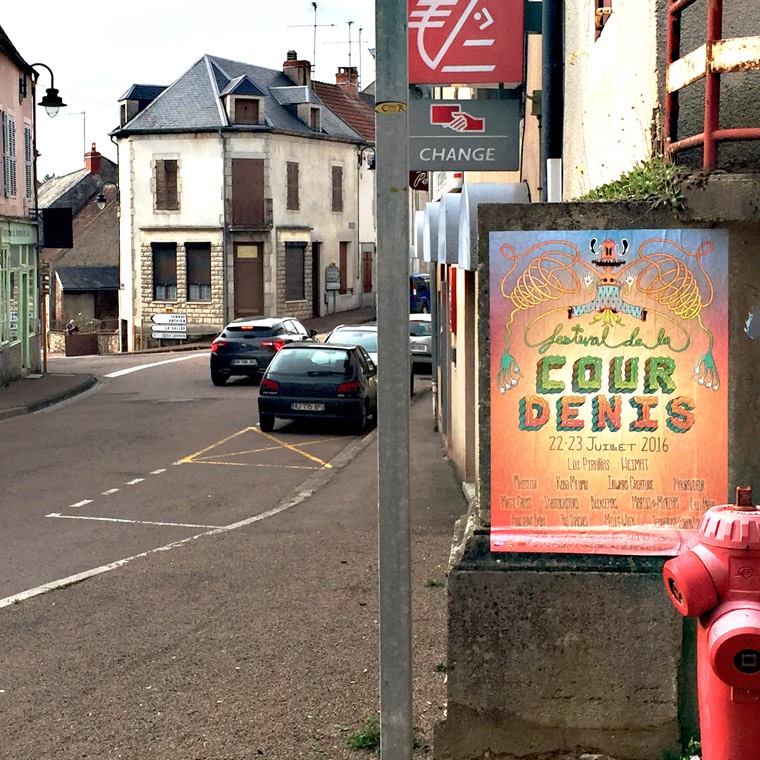
When it was all said and done, I traveled to France that summer to attend Festival de la Cour Denis for myself and see the poster in its natural habitat &emdash; picturesque little villages nestled in the lush green hills of French countryside. I arrived early to the farm where the festival is hosted each year. I witnessed first-hand all of the passion and effort that a relatively small team of French collaborators puts in to make the festival a reality.
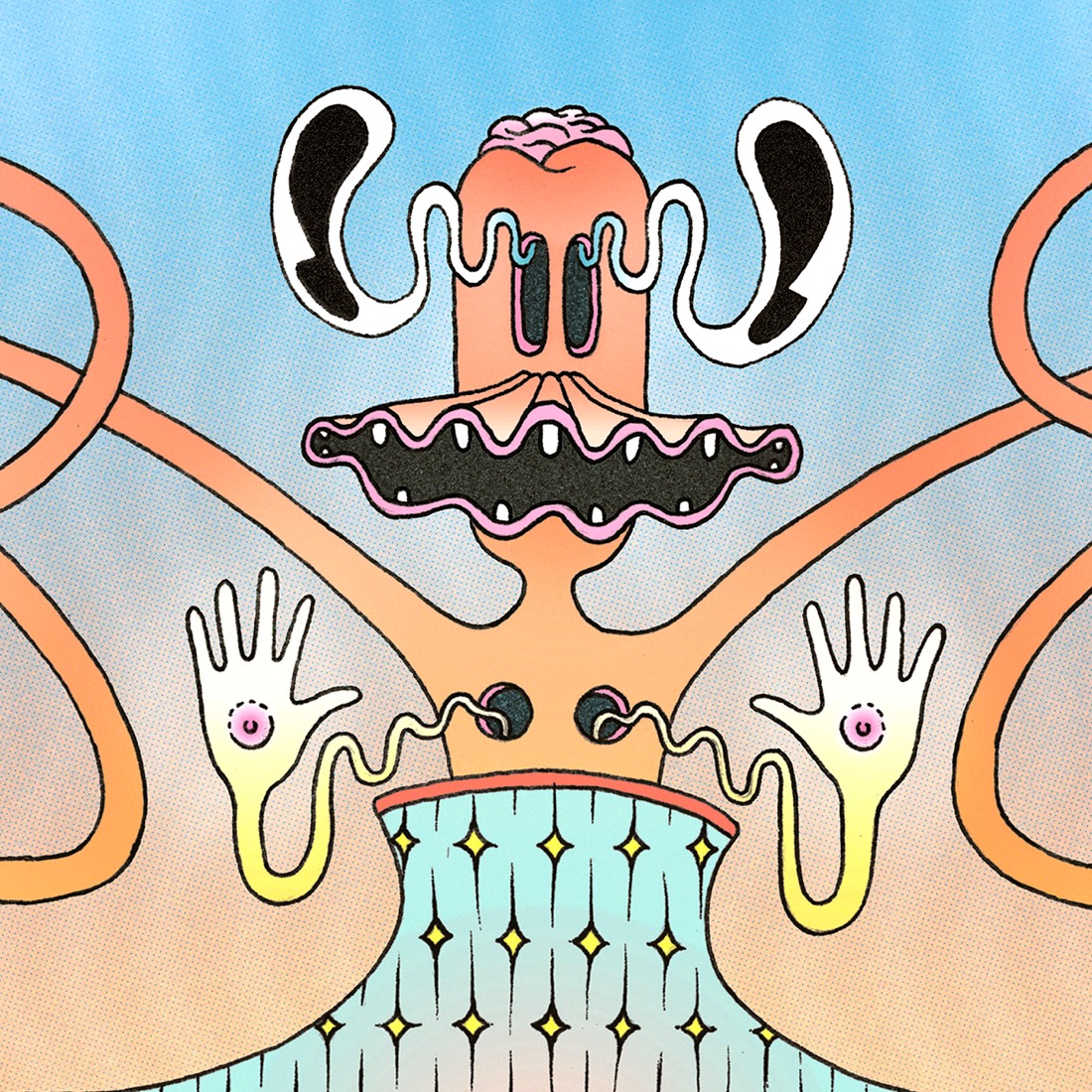
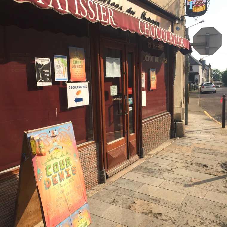
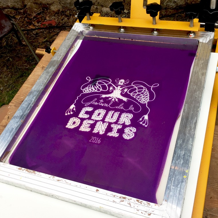
The design I had spent so many nights working on at my bedroom desk now spanned the entire width of a 20' wide truck trailer parked at the festival entrance. I saw it posted in the windows of bakeries and pharmacies in the nearby villages, and I watched as my design was screen-printed onto t-shirts as festival-goers began to pour in. Bands lit up the stages and music rolled over the hills surrounding the area. It truly felt like the most incredible dream.
In addition to the illustration, I created a responsive website utilizing elements that echo the color palette and font from my poster design. I wanted visitors to feel a sense of cohesion between all branded Festival de la Cour Denis materials. The website design included this nifty animated divider reminiscent of the wavey patterns found throughout the poster illustration.
