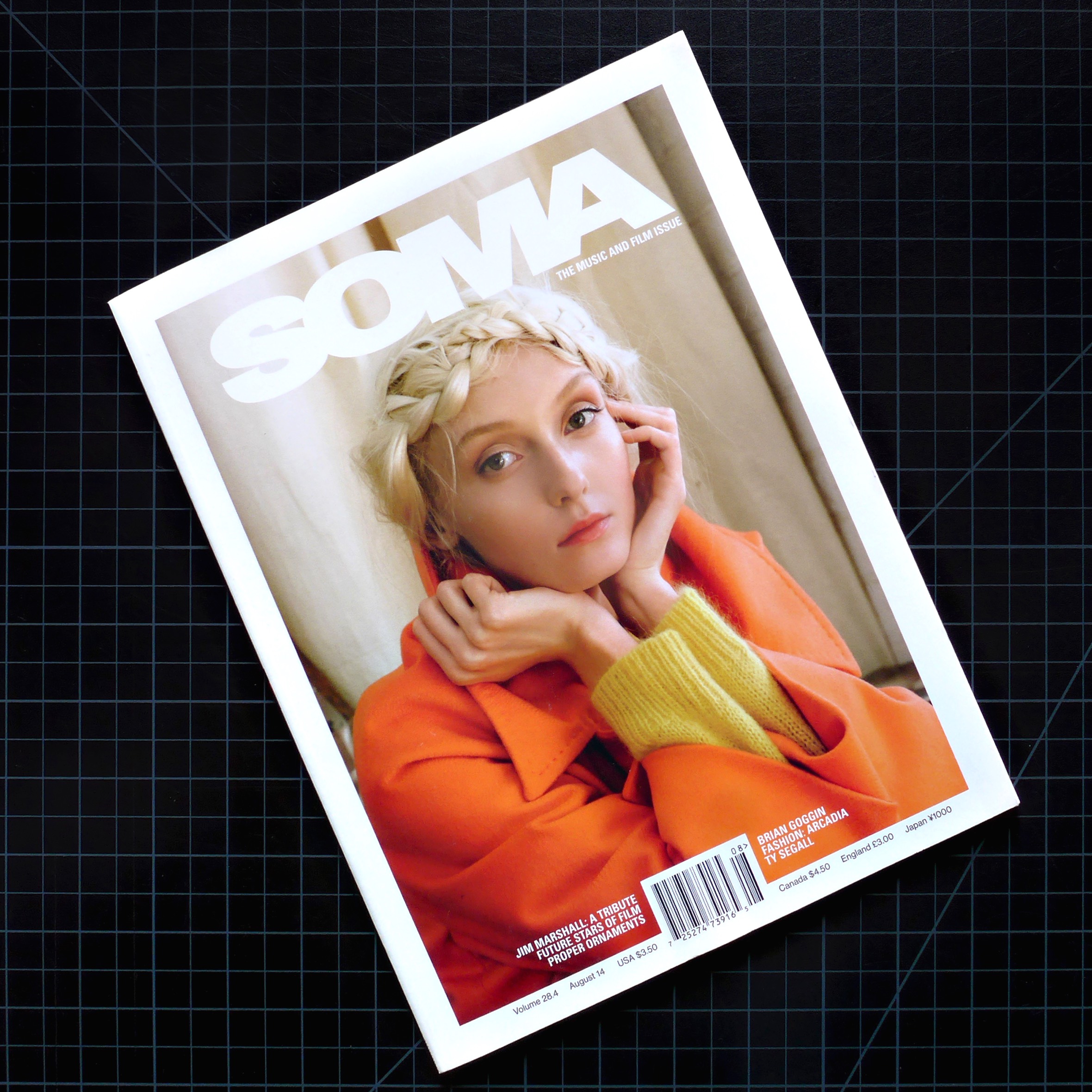
SOMA Magazine
Layout and direction provided for the iconic fashion and culture magazine read everywhere from Paris to Tokyo and NYC
Layout Design
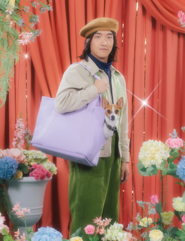
Sharp, minimal layouts were crafted for SOMA Magazine spreads, each design echoing the brand's elegant, chic presence. I collaborated with a talented team of writers, editors and photographers to ensure the creation of a top-shelf publication.
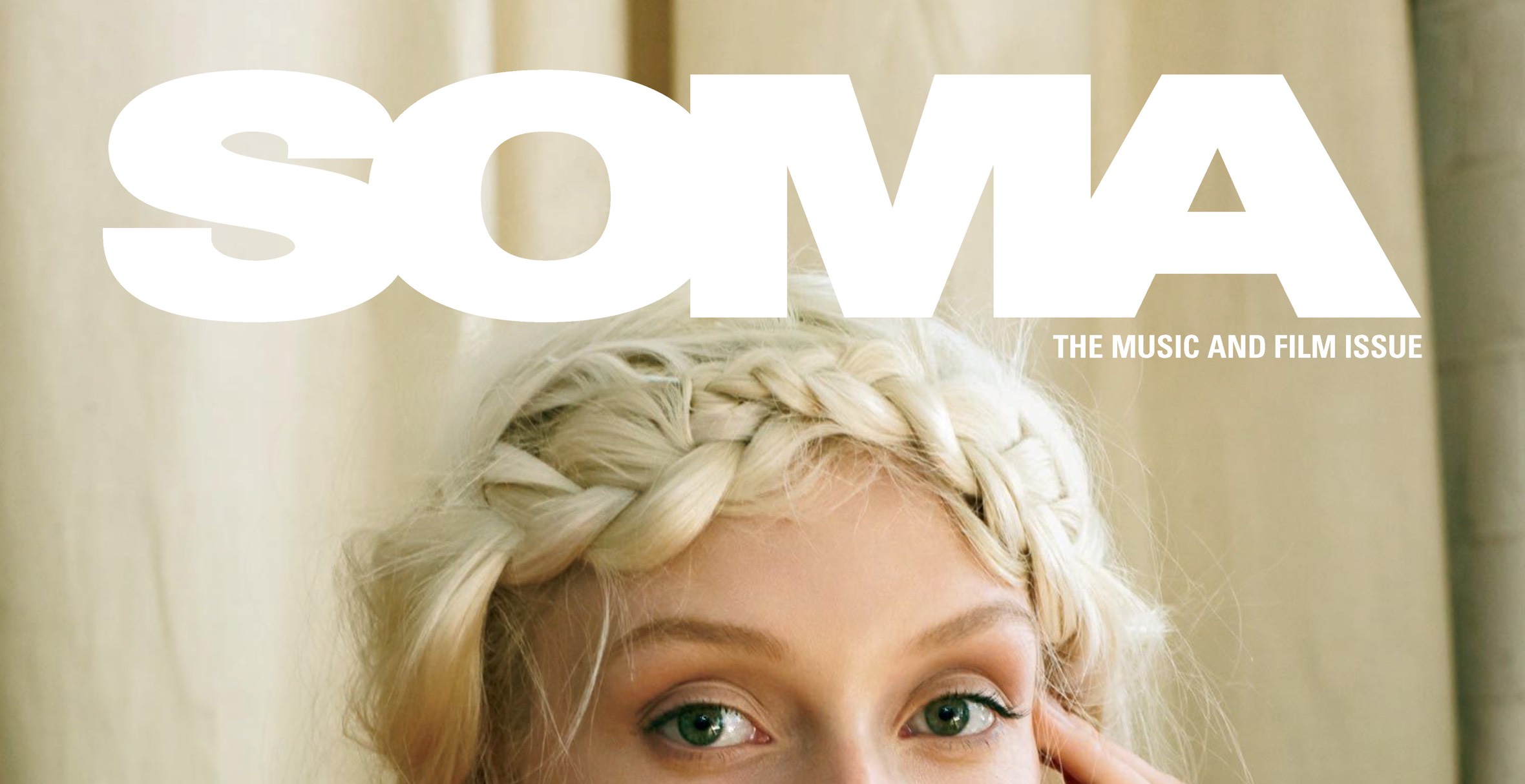
As Contributing Art Director at SOMA Magazine I was immersed in a bustling, fast paced environment where deadlines had to be met without excuse. I studied the ins and outs of SOMA's brand, as well as current fashion industry trends, to gain a better idea of the contemporary look and feel I was aiming for. I had to be well equipped to ensure that these insanely talented fashion designers and models got the spotlight they deserved.
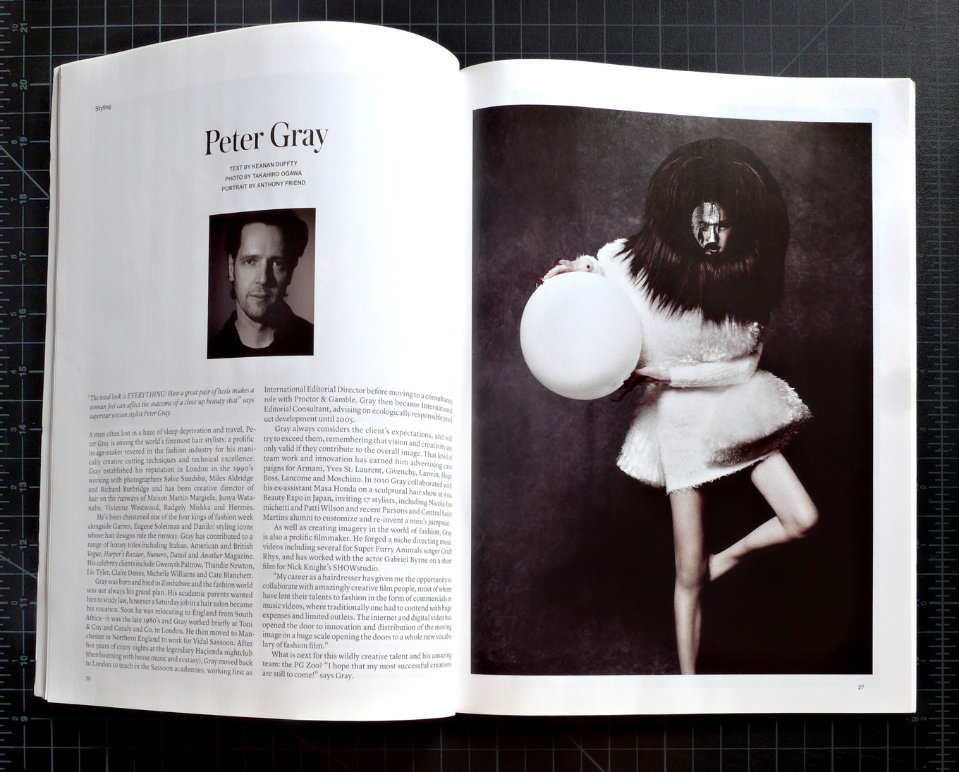
Once I had all the copy and imagery, I utilized InDesign to make every character of text appear legible and elegant, and each photograph stand out in its own regard. Once all layouts were edited and approved, I formatted the files and sent them over to the printer for production.
It was wonderfully surreal to walk into the historic City Lights Bookstore in San Francisco, and spot the vibrant cover of a magazine I had spent so many hours carefully crafting sitting on the shelf. Seeing each page's text and images in their final, physical form added to the effect. It was a proud moment.
