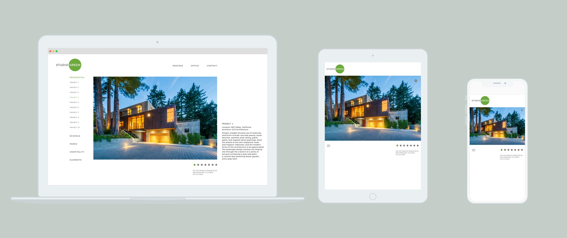
Studio Green Website
Minimal, responsive Bootstrap website constructed for innovative Bay Area landscape architecture firm
Web Design
Studio Green hired me as a freelancer to craft their website. I collaborated closely with the project's design lead, transforming static mockups into dynamic web pages that elegantly adapt to any device they are viewed upon.
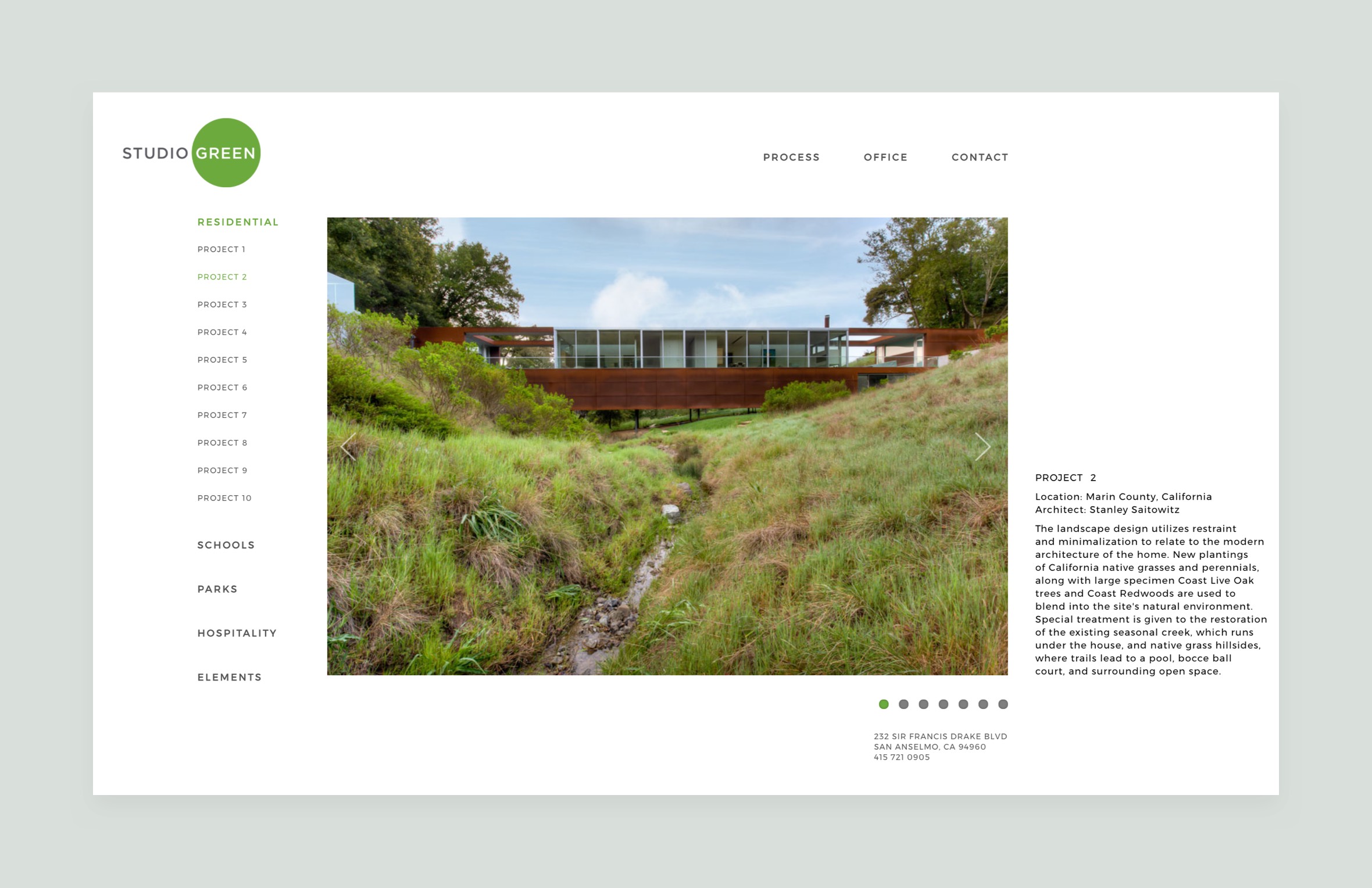
In this the age of handheld devices responsive websites are a necessity. When landscape architecture firm Studio Green realized that their website had become less effective due to it's non-responsive format, I was hired to create a remedy. Well versed in the world of responsive design, I took on the project to ensure their work would look gorgeous on any screen.
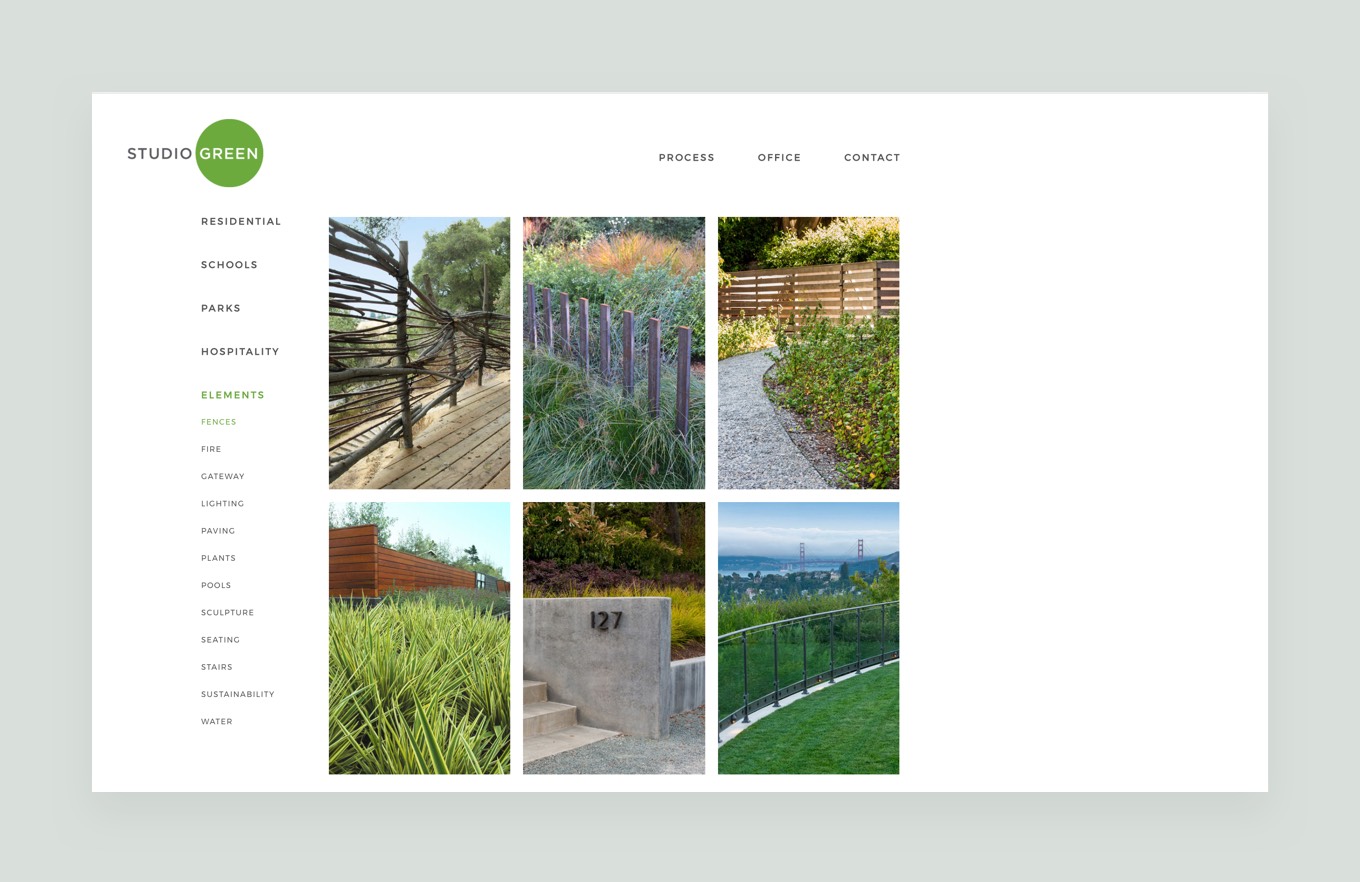
All imagery was resized and formatted properly for web, allowing for the fastest load times possible once they were up on the Studio Green site. Additionally, I provided search engine optimization for the new website so potential customers could find Studio Green's professional services at the top of search engine results.
The project's senior designer provided mockups and notes for reference throughout the coding and testing phases. I tested responsive layouts and features before they went live, ensuring that everything would operate as intended. Studio Green's senior designer was incredibly detailed in her layout specifications, and we collaborated closely so all imagery, text, and CSS3 animations would display as intended. I arranged every element down to the last pixel in order to mirror mockups precisely.
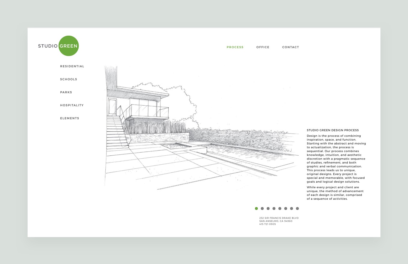
While mockups of desktop layouts were provided from the start, tablet and mobile mockups were initially absent. Careful consideration was made to establish these additional layouts on the fly. The final website is fully responsive and lightweight, scaling gracefully no matter which screen size it is being viewed on.
