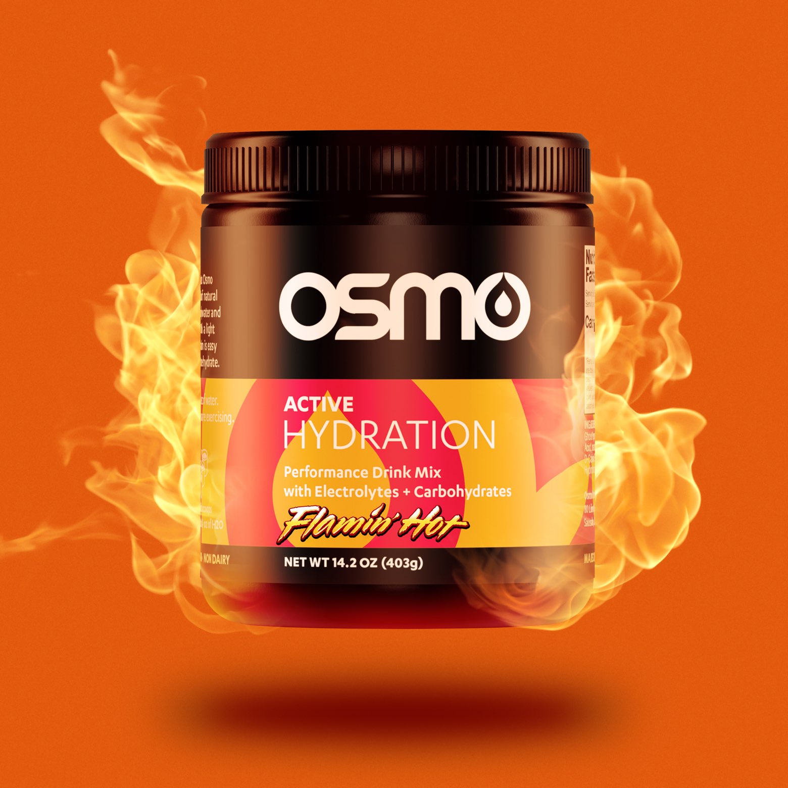
After getting to know the Osmo brand and audience inside and out, I applied my research towards a packaging redesign. In collaboration with a 7D creative director Lee Hutchinson we gave the entire product line a striking and modern new look.

When I first started working with Osmo it was being marketed towards elite athletes, and the packaging reflected that. I began working on a redesign with the goal of appealing to a broader audience, including amateur athletes and casual workout enthusiasts.
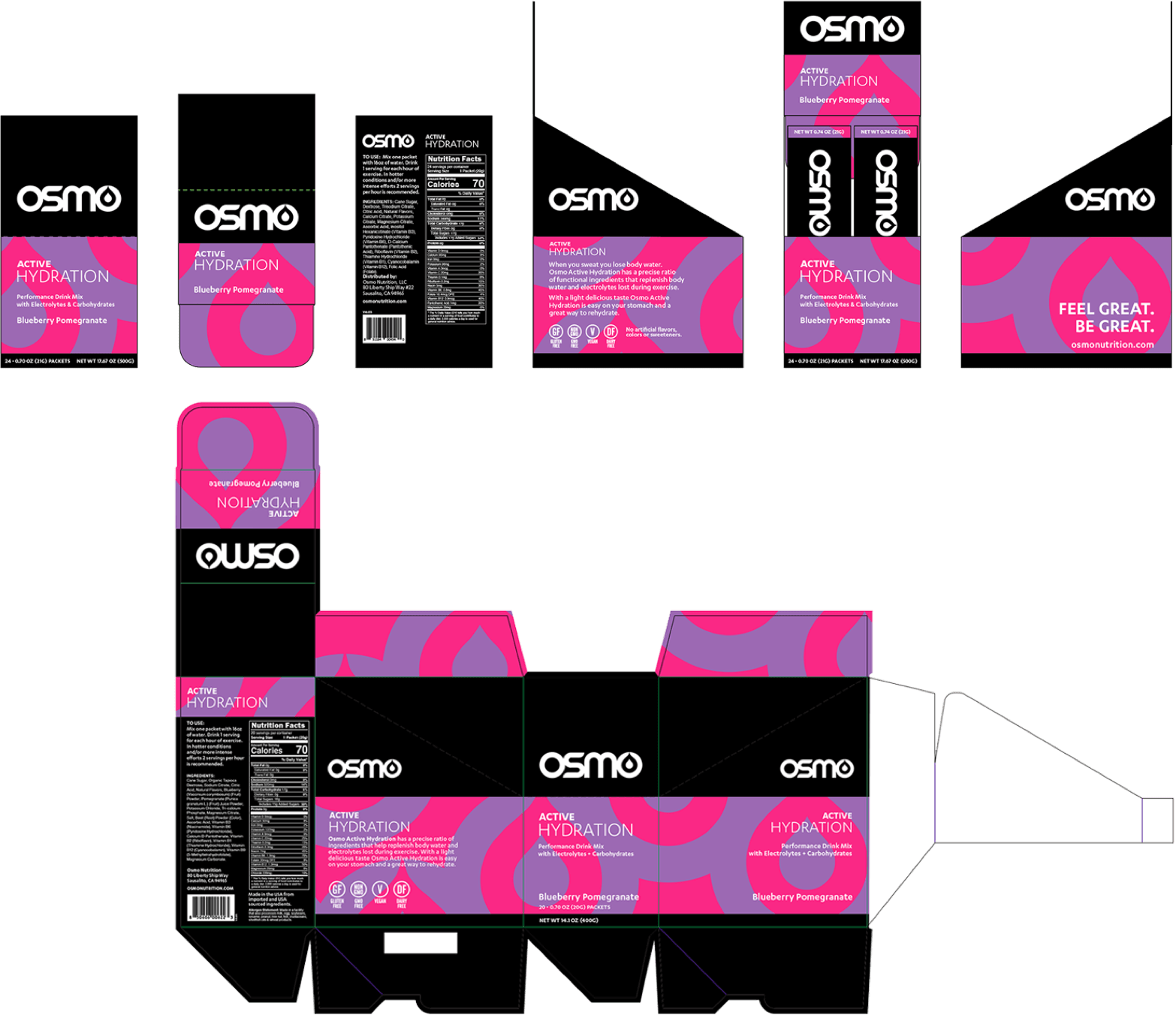
The new packaging direction would need to stand out beside competitor products on store shelves, so I took time to research how other brands present their hydration products. Working closely with 7D creative director Lee Hutchinson, I began experimenting with new options.
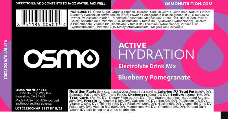
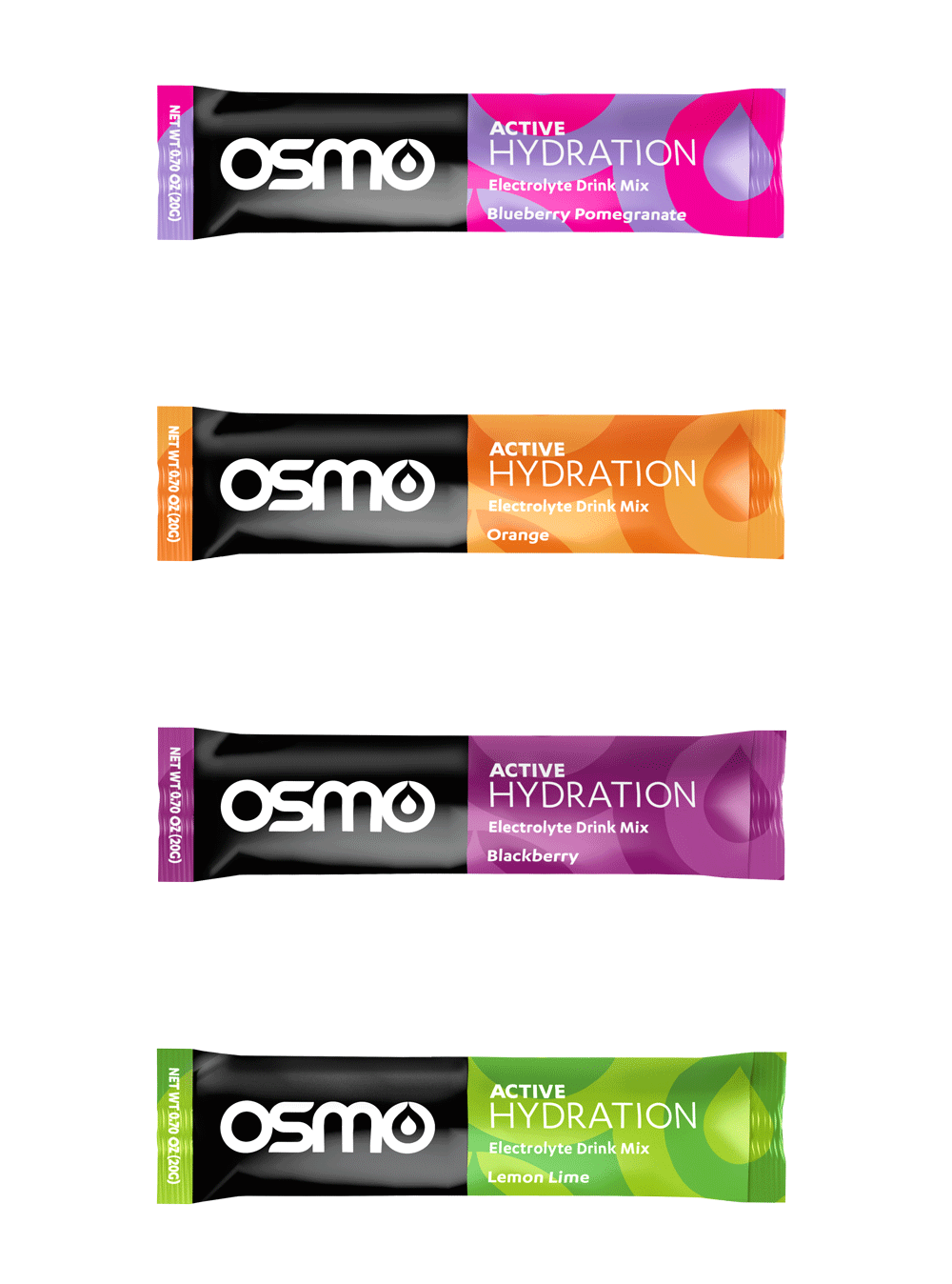
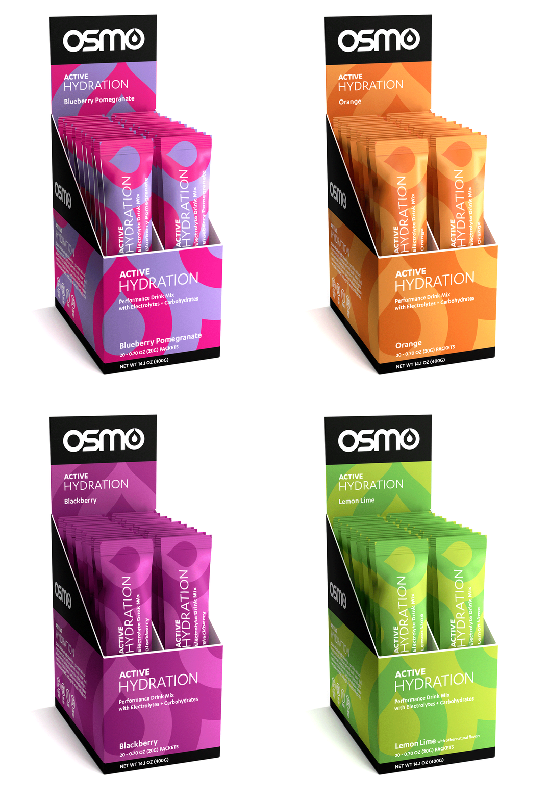
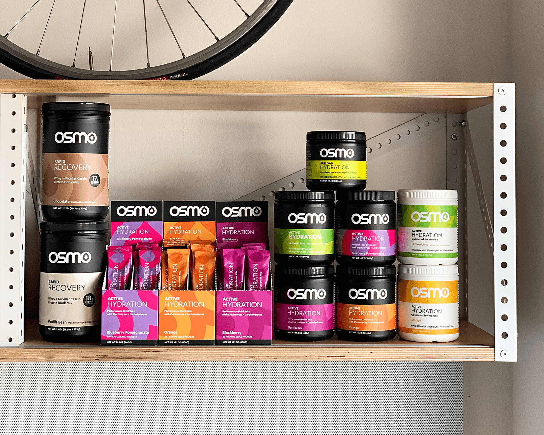
Many concept iterations later, an exciting new direction was decided upon. Building on the previous, mostly-black packaging, bold colors and geometric shapes were paired with a clean, modern aesthetic. This bright and colorful appearance more closely aligned with the energetic lifestyles of Osmo users. It proved to be an eye-catching display both online and on store shelves.
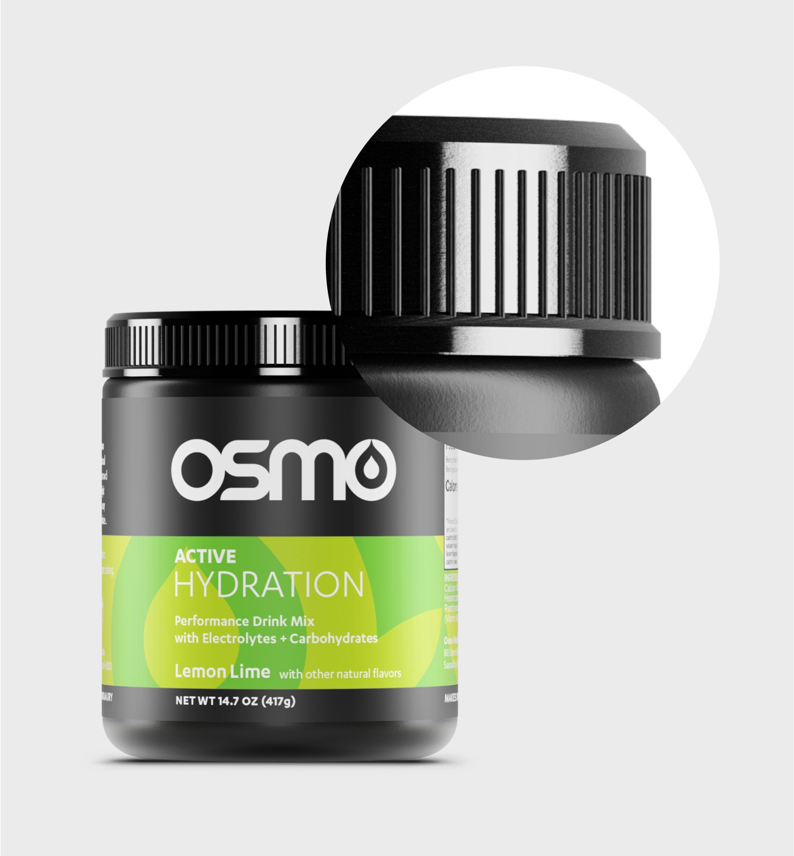
In addition to Osmo packaging design, I also created a series of 3D product renderings. Starting with very limited 3D software experience, I tried both Cinema 4D and Blender and ended up sticking with Blender. I built up my skills and studied advanced techniques to produce these sharp, lifelike renderings.
Flamin' Hot Osmo is sure to make you sweat during your workout (my attempt at an April Fools gag). I rendered the product in Blender and took it into Photoshop to composite the flames.
