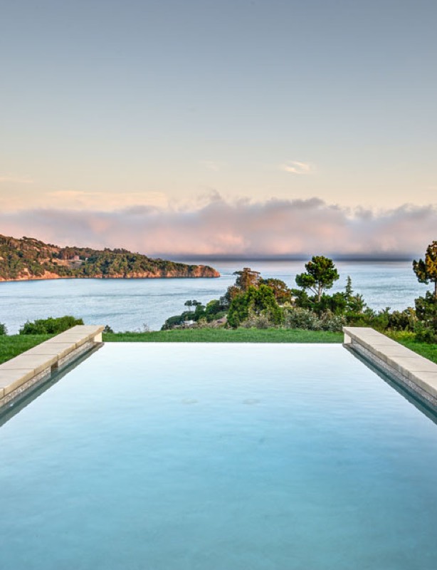
Google – Marine Illustrations
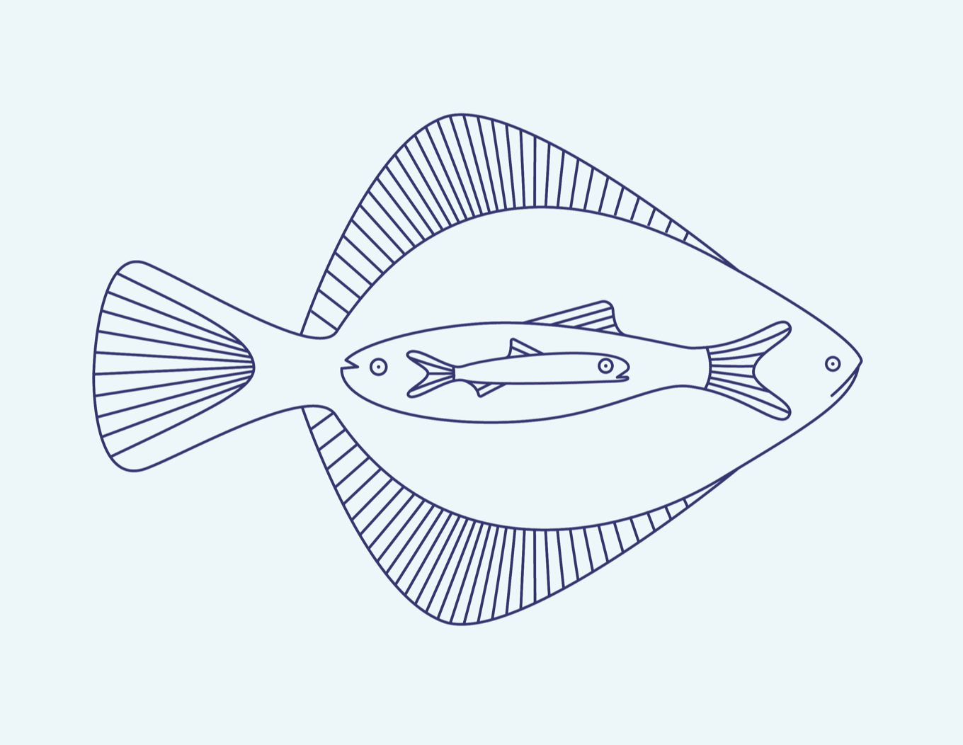
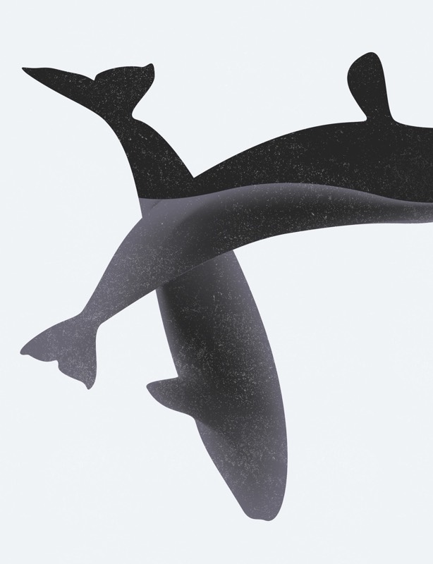
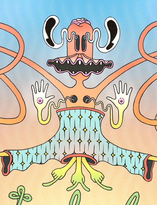
Marine themed illustrations showcase the vibrant Bay Area sea life living in the nearby waters and wetlands
Illustration
During my stint at Media-Objectives I illustrated Bay Area sea life in a rapid flurry of concepts and ideation. In collaboration with a seasoned design team, I conducted research on natural habitats surrounding the structure where these illustrations would eventually live.
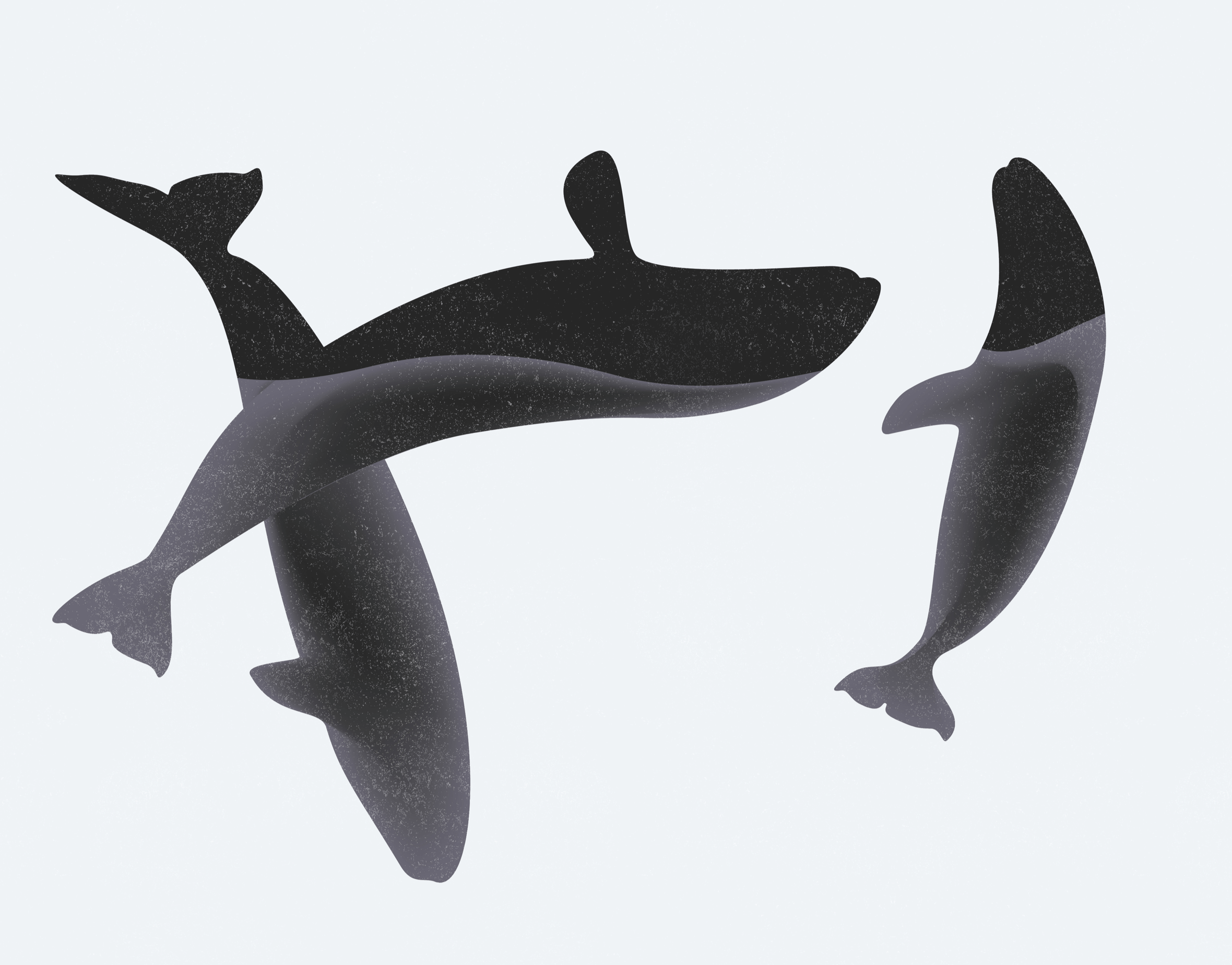
With a heap of sketches in hand, I met with the project lead to narrow them down to the best of the best. The final selection contained the more minimal, modern looking compositions, which reflected Google's own clean and simple branding.
After receiving the design brief I began studying the flora and fauna within the waters of the southern Bay Area. I quickly sketched out some ideas to get the creative juices flowing.
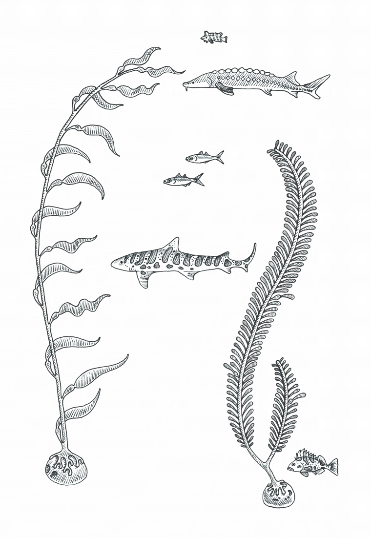
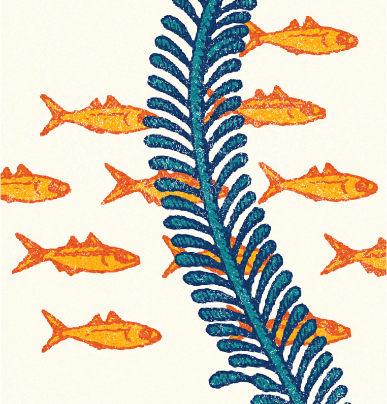
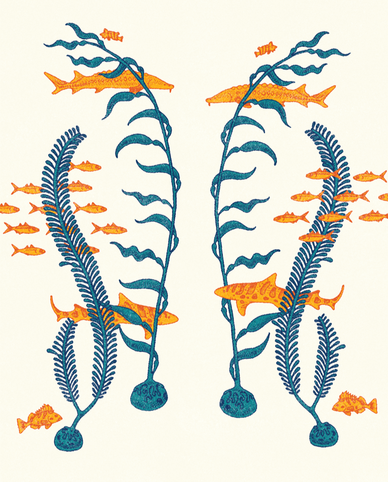
Using vellum I carefully traced over my initial sketches, transforming them into much cleaner line drawings. After scanning the drawings into digital form I recreated them in Adobe Illustrator. The vector format would allow the work to be printed at any size depending on how much wall-space they would eventually need to occupy.
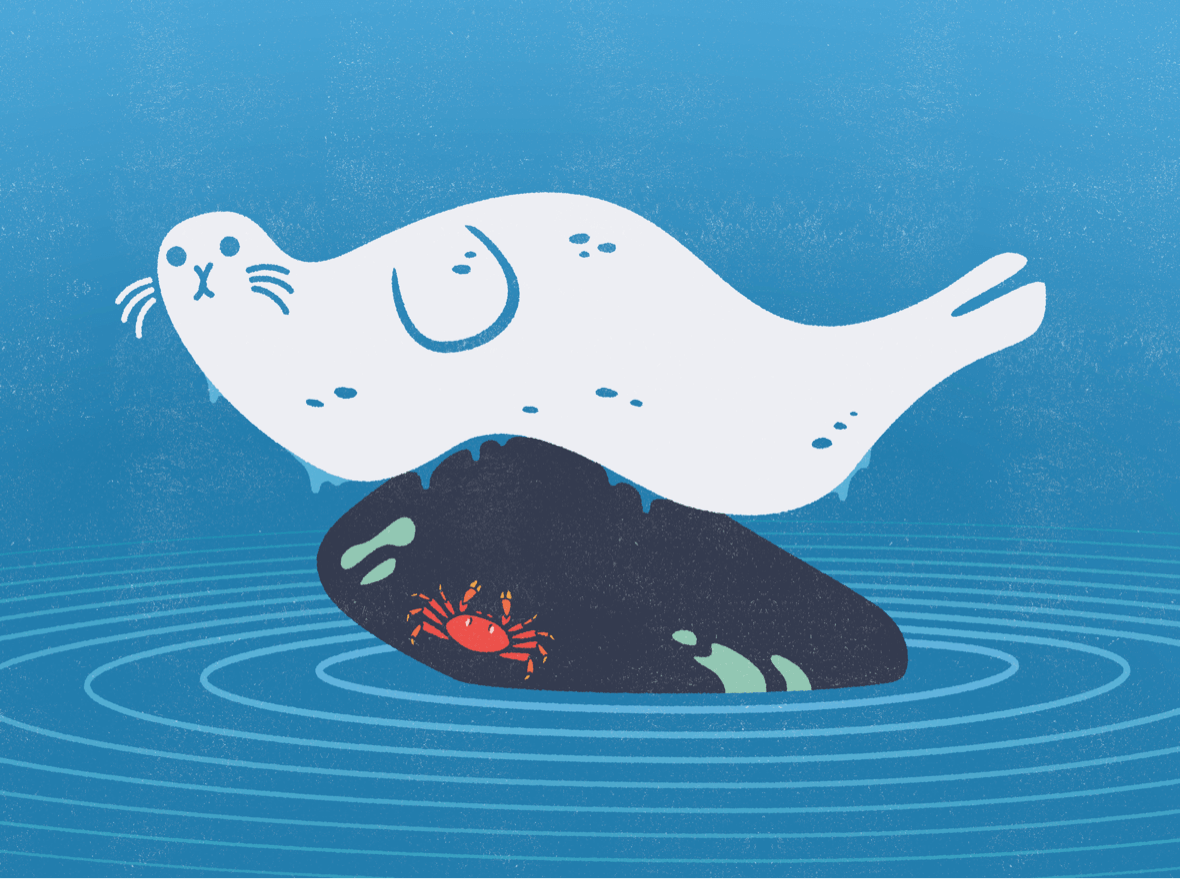
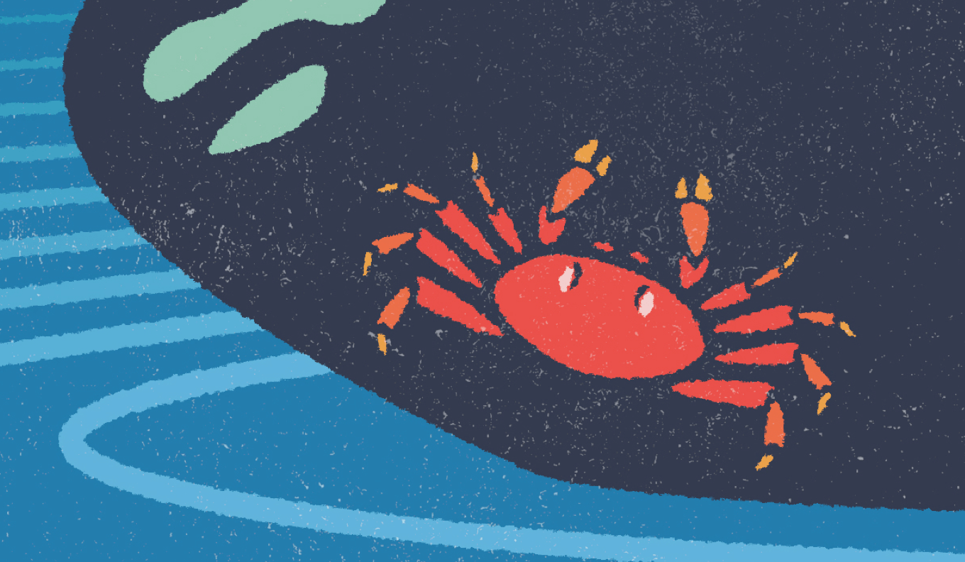
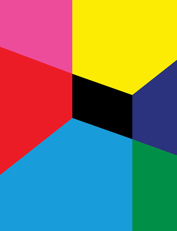
One of my favorite moments in the design process is experimenting with color in Illustrator. I'm able to quickly jump between palettes and pairings until I arrive at one or two color combinations worth sharing. I drew color palette inspiration from vintage nautical illustrations.
With four distinctive illustrations laid out in Illustrator I added a touch of sea-worn texture and they were ready for production.
