Adobe Wayfinding
Simple icon set and map to guide new Adobe employees around a confusing parking structure
Graphic Design
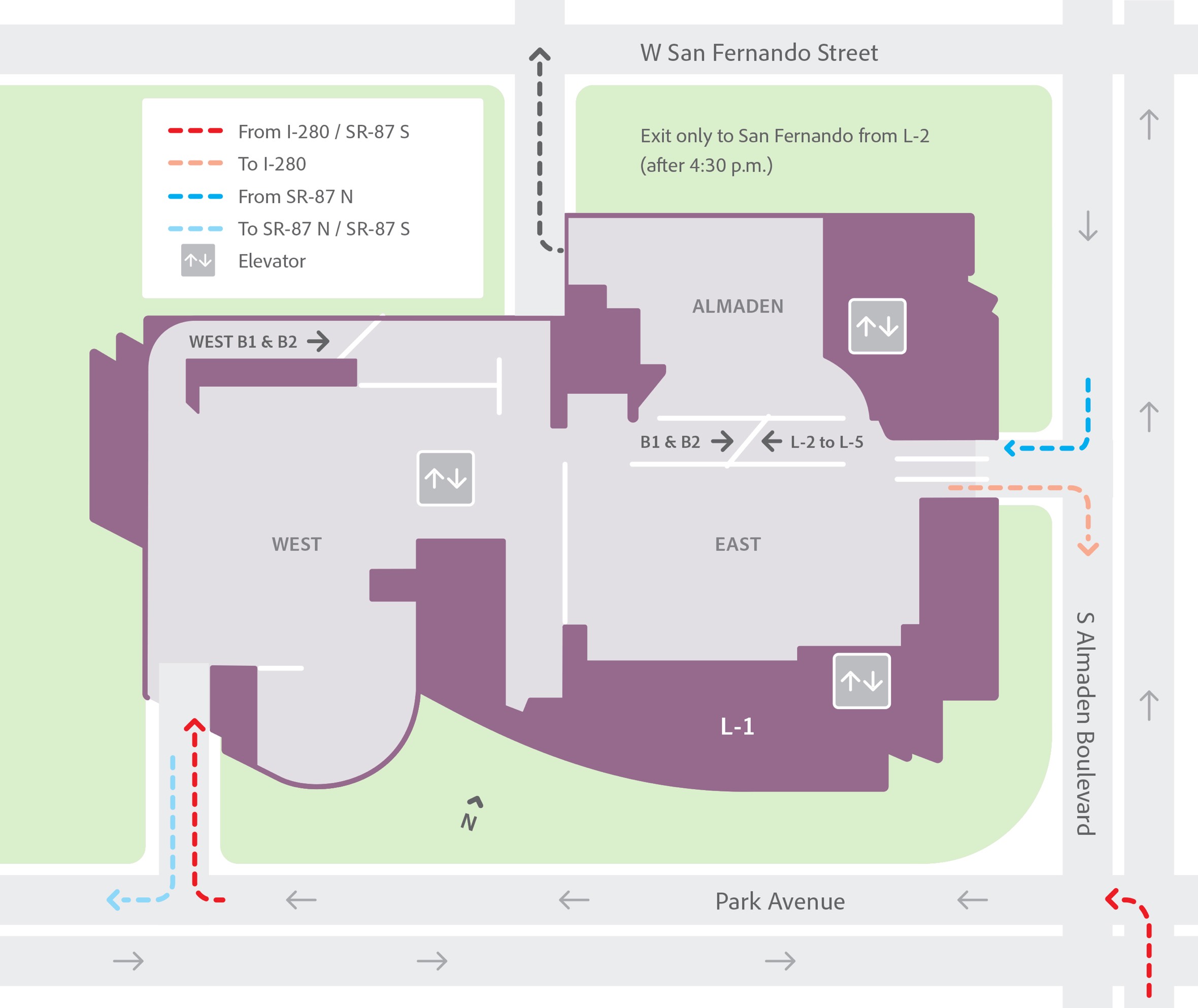
As a contract designer at Media Objectives, I was assigned to design iconography and an easy-to-read map that would be used to help new employees find their way around the maze-like parking garage at Adobe San Jose.
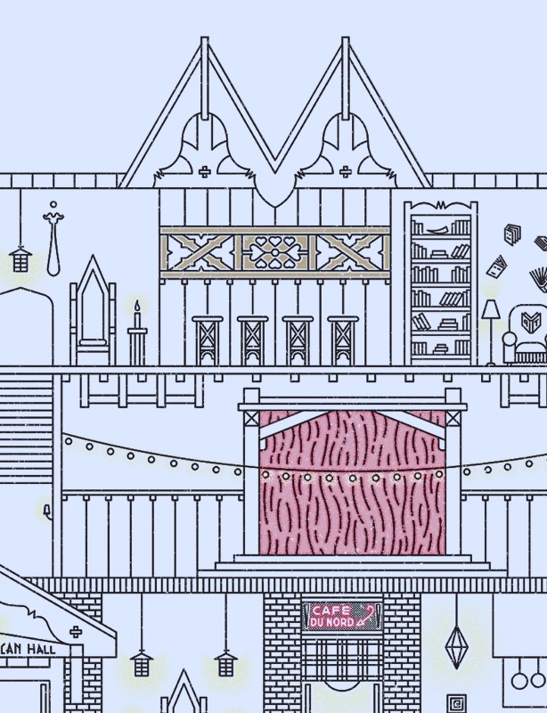
I crafted this cohesive set of lightweight icons to be instantly identifiable. A 32-pixel grid was utilized during the design phase so size would remain consistent. Subtle gaps are intentionally added to the lines that compose each symbol, adding both a stylistic element and removing some extra visual weight from the designs.
For the parking map illustration, I referenced blueprints of the parking structure but made sure not to over-complicate things. My goal was to ensure that it remain highly readable and easily understood.
